Sparklines are tiny mini-charts that are contained wholly within worksheet cells. Sparklines were introduced in Excel 2010. They allow users to visualize data and showcase trends or patterns. They are simpler than full charts for examining single rows or columns.
There are a few different types of sparklines:
- Line sparklines
- Column sparklines
- Win/Loss sparklines
Line sparklines are similar to a line chart for a single variable. Column sparklines are similar to a column chart and are useful for comparative analysis between data points. Win/Loss sparklines show each data point or classify each data point as either a win or loss.
Sparklines are usually positioned in most spreadsheets near or right next to their data sources.
Introduction
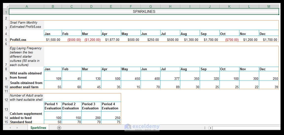
We have some data from a hypothetical small business owner who started a snail farming venture.
Using the Win/Loss Sparklines
The small business owner has been running the snail farm for five years. They have the data for the previous year’s monthly profit/loss farm statistics. This type of data can be adequately visualized and summarized using the Win/Loss sparklines, where a monthly profit is designated as a win, and a monthly loss is designated as a loss.
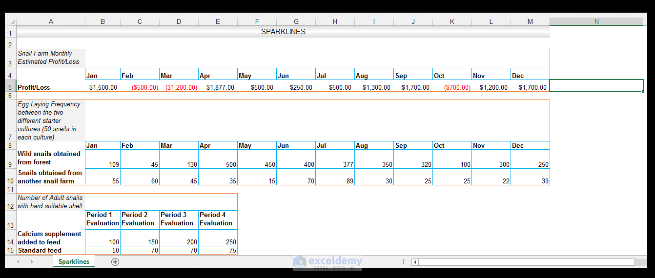
- To create this Win/Loss Sparkline, select cell N5, which is right next to the source data.
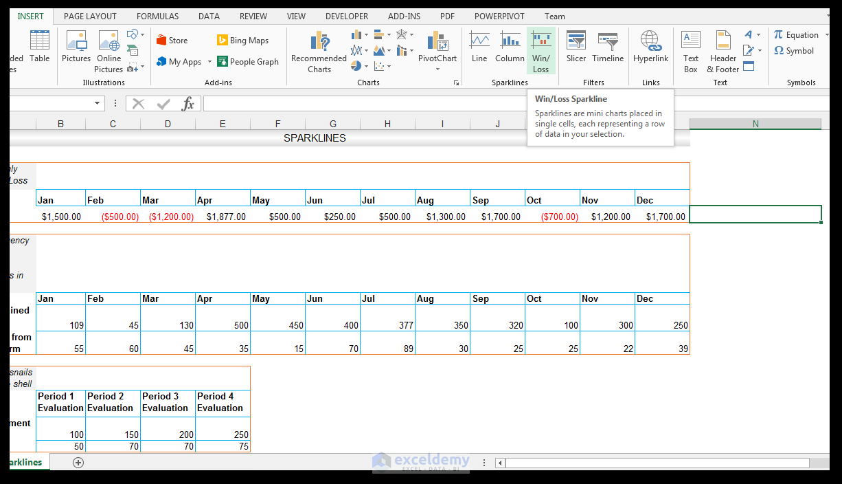
- Go to Insert and choose Sparklines, then select Win/Loss.
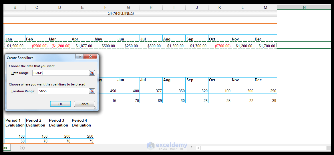
- The Create Sparklines Dialog box will appear and you will be prompted to select the Data Ranges.
- Leave the Location Range as-is (Excel usually automatically detects the location range based on the originally selected cell).
- Select the B5:M5 range as the Data Range, as shown below.
- Click OK.
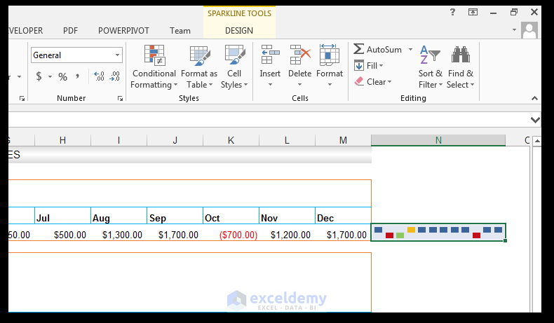
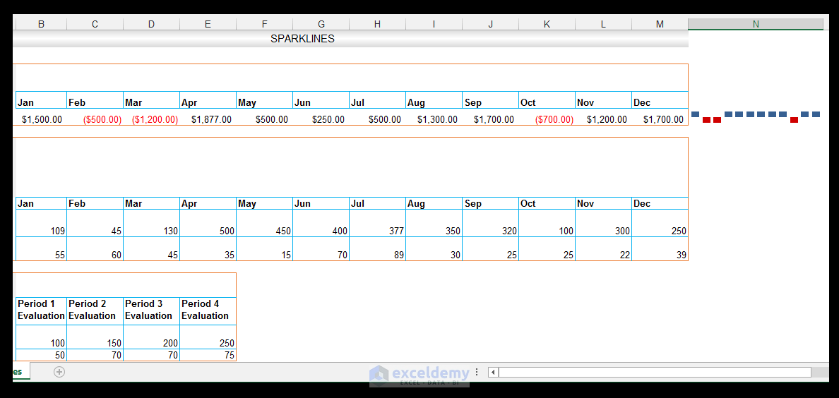
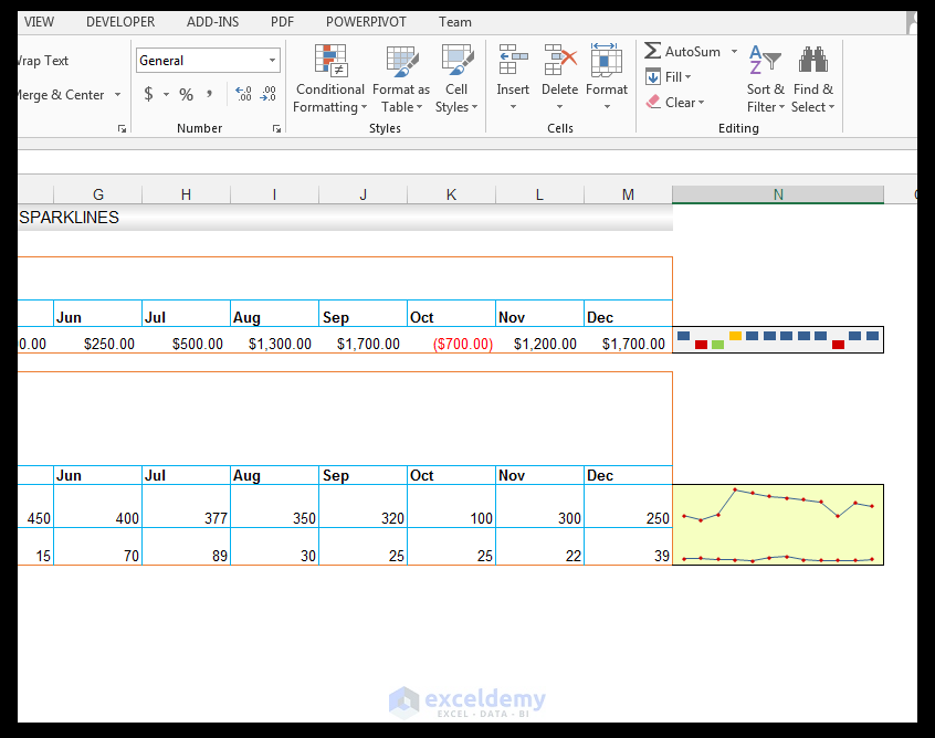
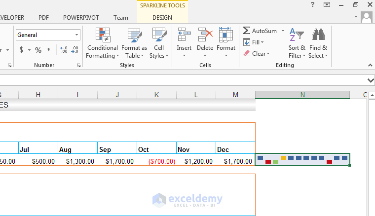
- The Win/Loss sparklines modeling the monthly data are shown in cell N5.
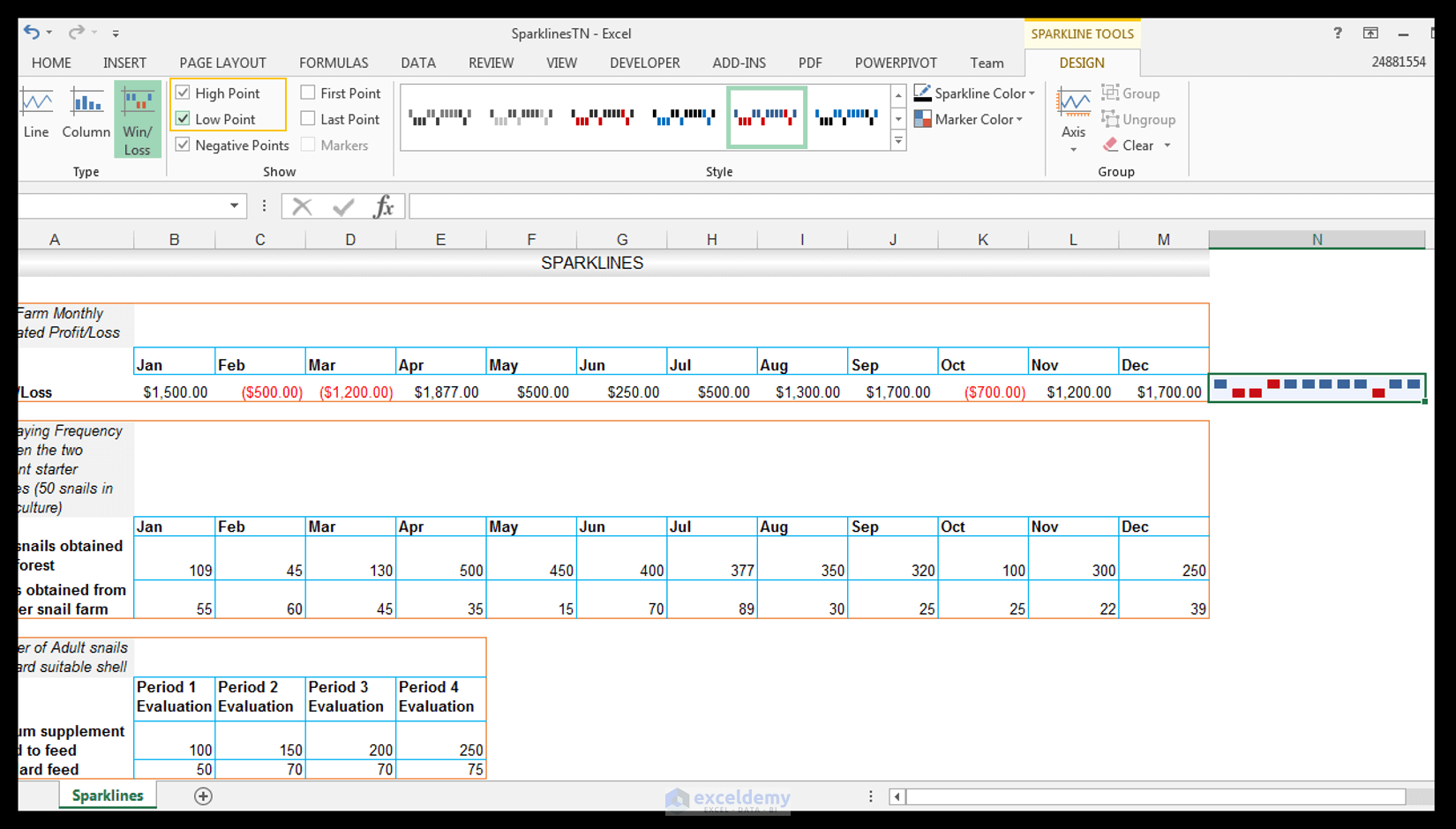
- We can highlight additional information using the Context-Sensitive Sparkline Tools Menu. Go to Design and Show and check High Point and Low Point.
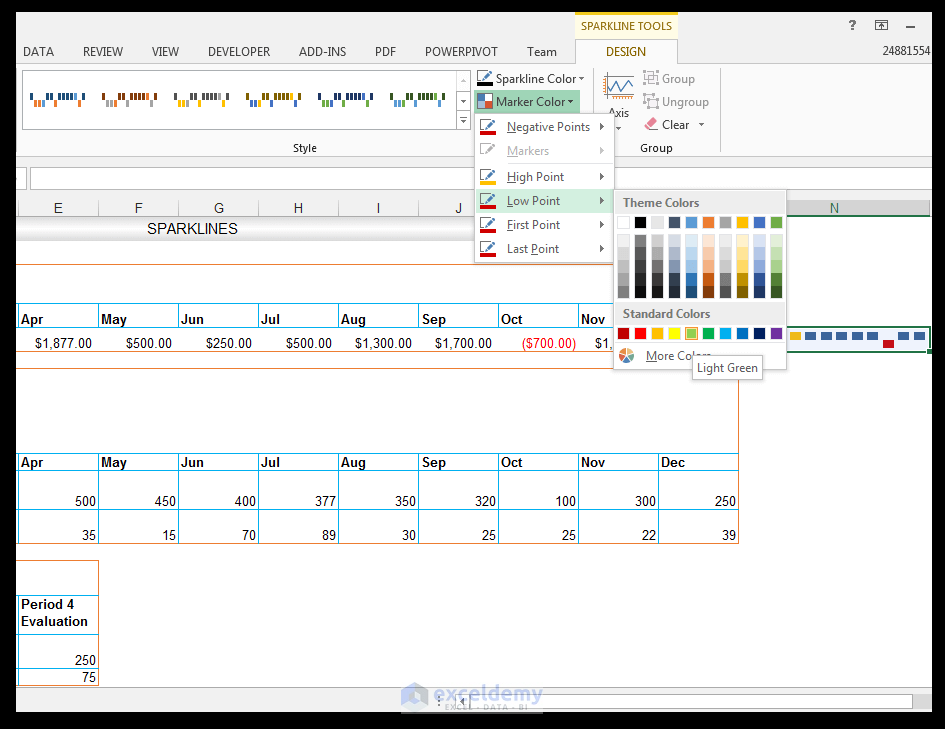
- We want to change the colors of the High Point and the Low Point since it can be a bit confusing to have the same colors that are being used for the rest of the points. With cell N5 still selected, go to Sparkline Tools Design and choose Style, then click on the drop-down next to Marker Color.
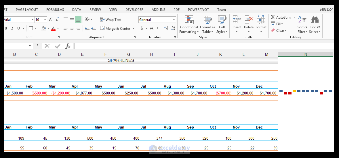
- Go to High Point and select orange (or any other color that is not the red and blue color currently being used).
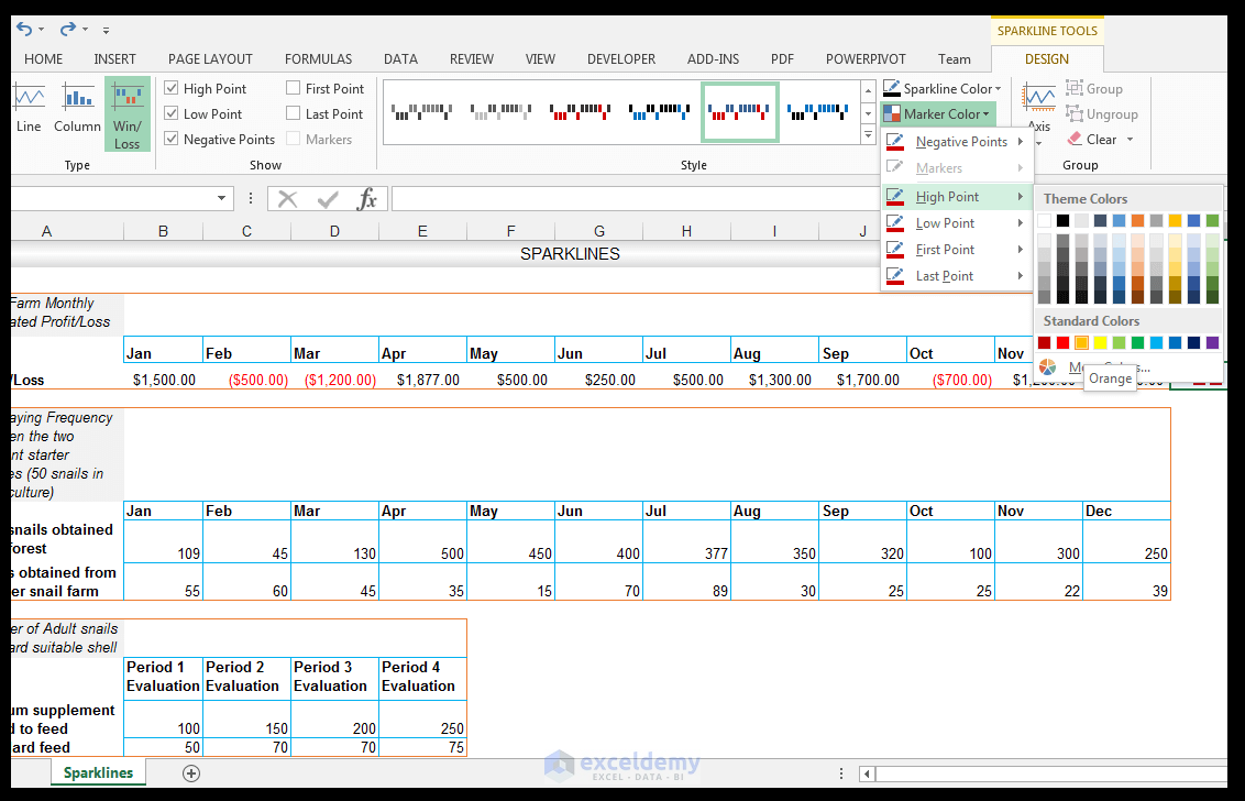
- The highest point or profit amount, in this case, is now formatted with orange color as shown below.
- For the Low Point, choose light green as shown below.
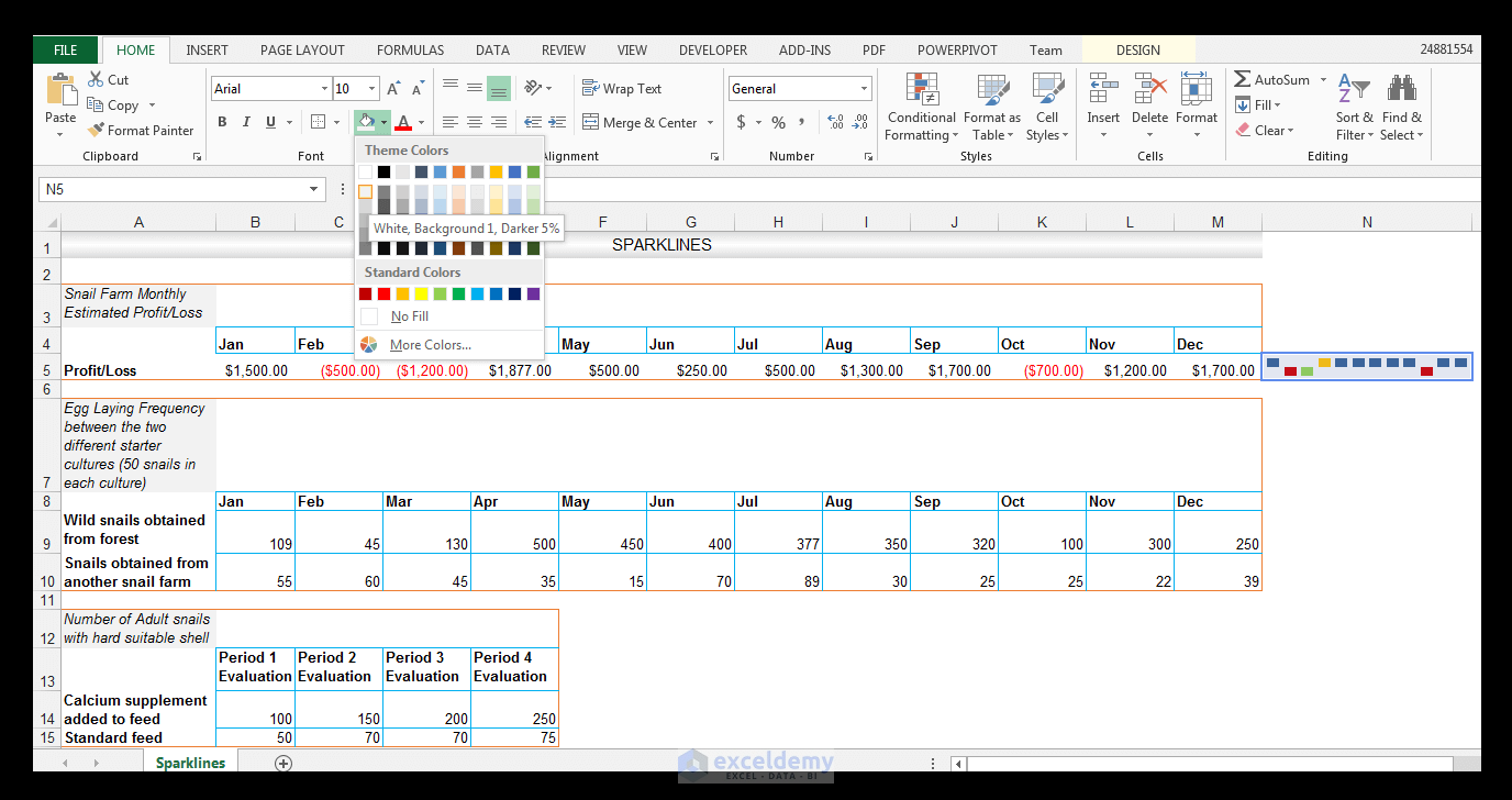
- With cell N5 selected, go to Fill and fill the cell with a light grey filling, in this case, White Background 1, Darker 5%.
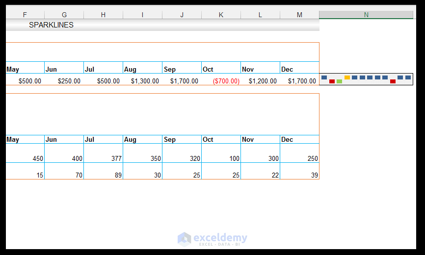
- With the cell still selected, give the cell a Top Border, a Bottom Border, and a Right Border.
Using Line Sparklines
The farmer measured the total amount of eggs obtained monthly from the two cultures.
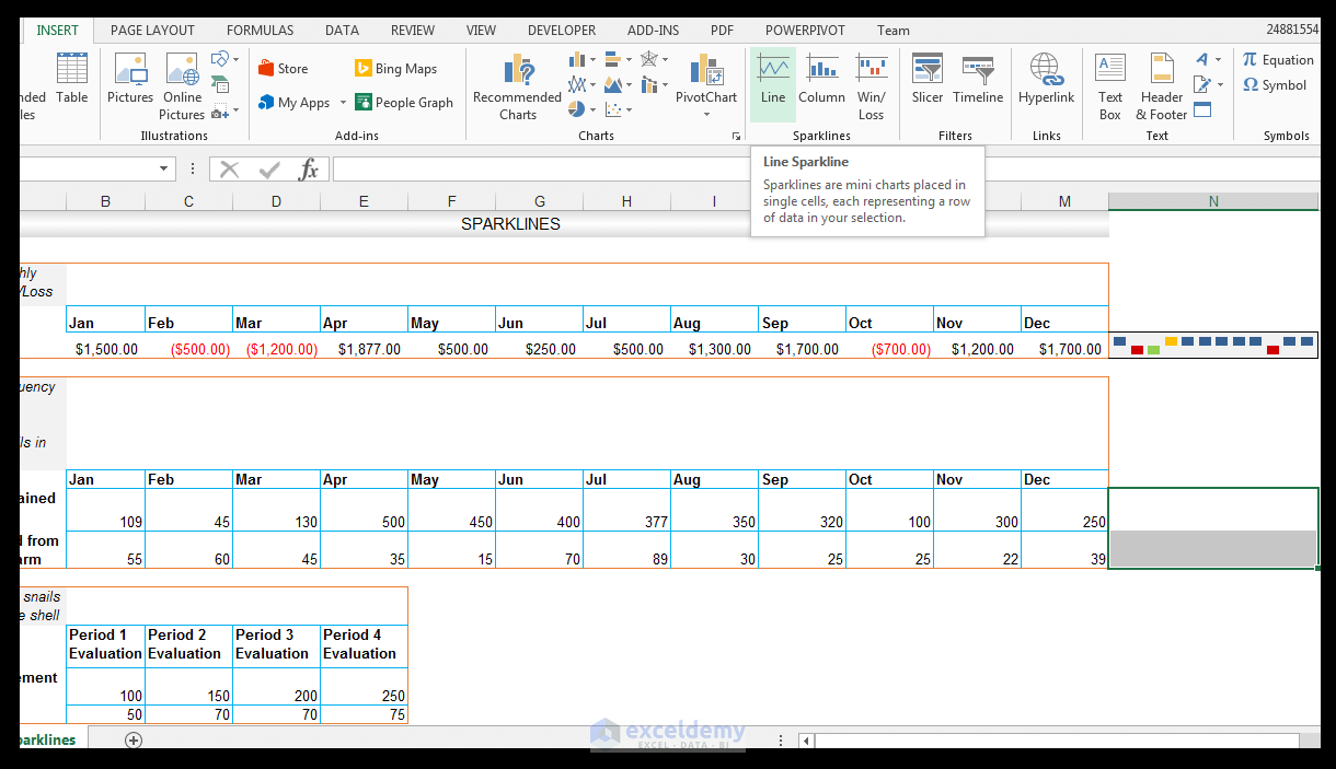
- We want to showcase the monthly egg laying frequency of each starter culture visually with Line sparklines.
- Select the range N9:N10 and go to Insert and Sparklines, then choose Line.
- In the Create Sparklines dialog box, select the Data Range of interest, which in this case is range B9:M10 as shown below.
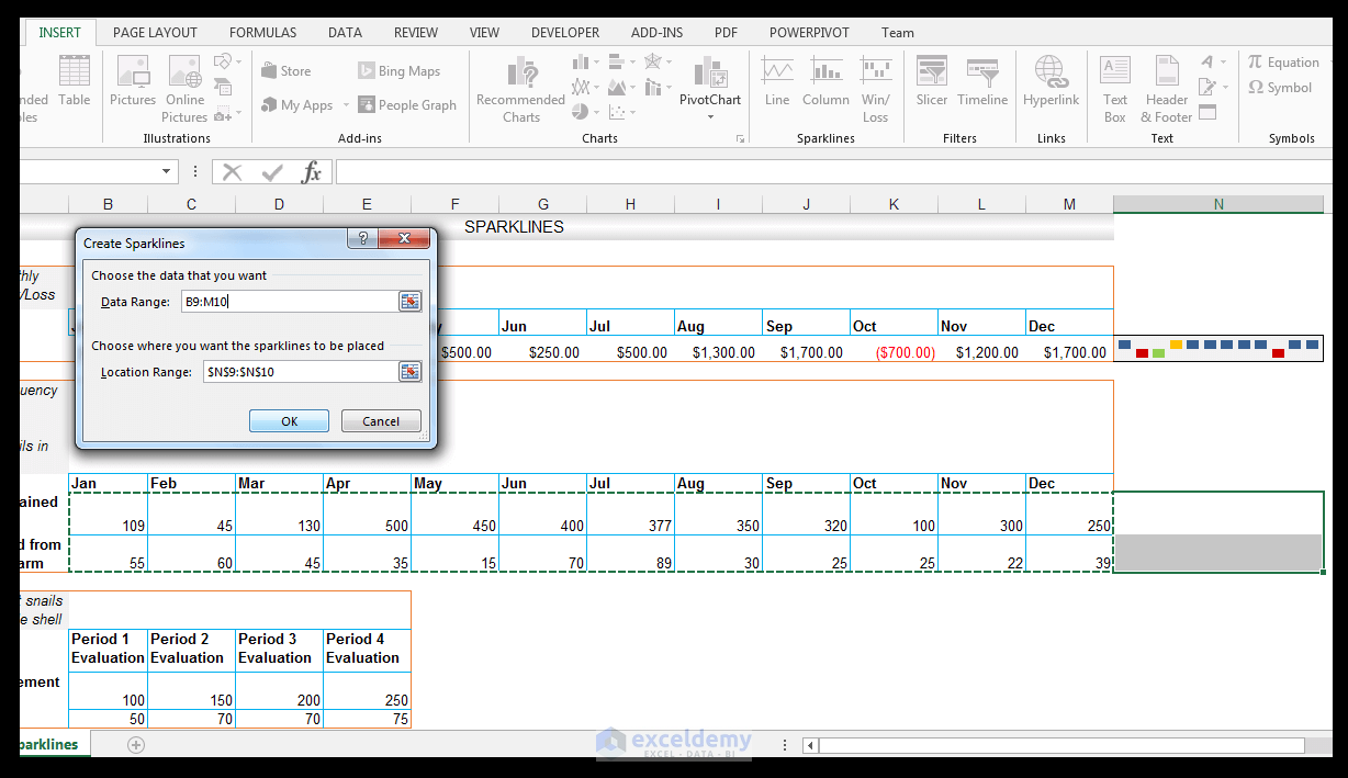
- Click OK.
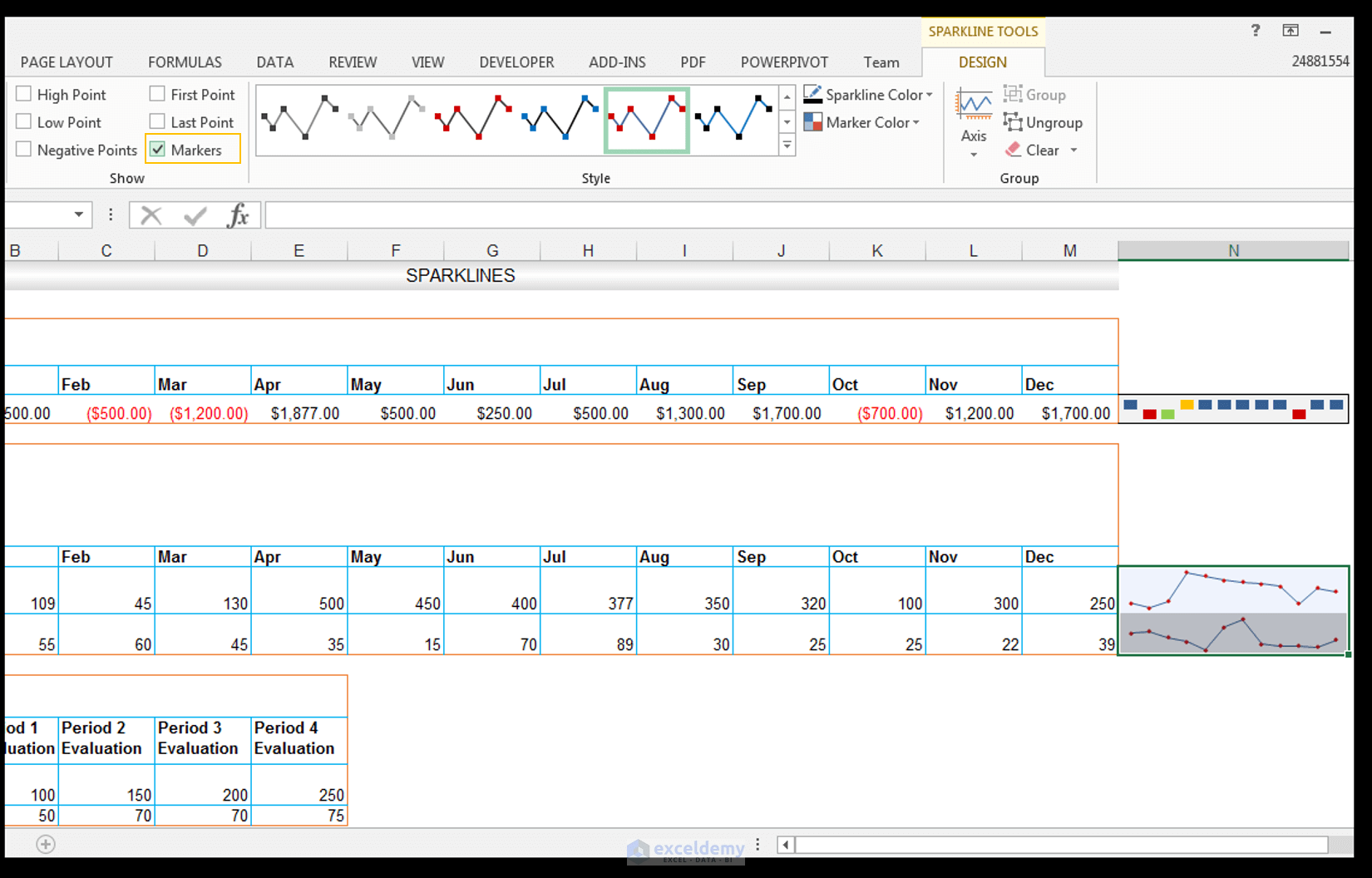
- The Sparklines are automatically grouped, so all formatting changes will be applied to both of them.
- Go to Sparkline Tools and Design, then check Markers in Show to show the markers for points in the line.
- Go to Sparkline Tools and Design and click on the drop-down arrow under Axis.
- For the Vertical Axis Minimum Value Options, change this from Automatic for all Sparklines to Same for All Sparklines.
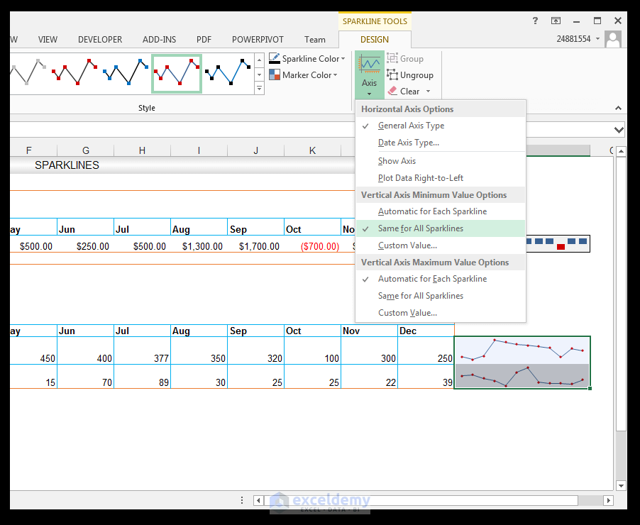
- Go to Sparkline Tools and Design, then click on the drop-down arrow under Axis.
- For the Vertical Axis Maximum Value Options, change this from Automatic for all Sparklines to Same for All Sparklines.
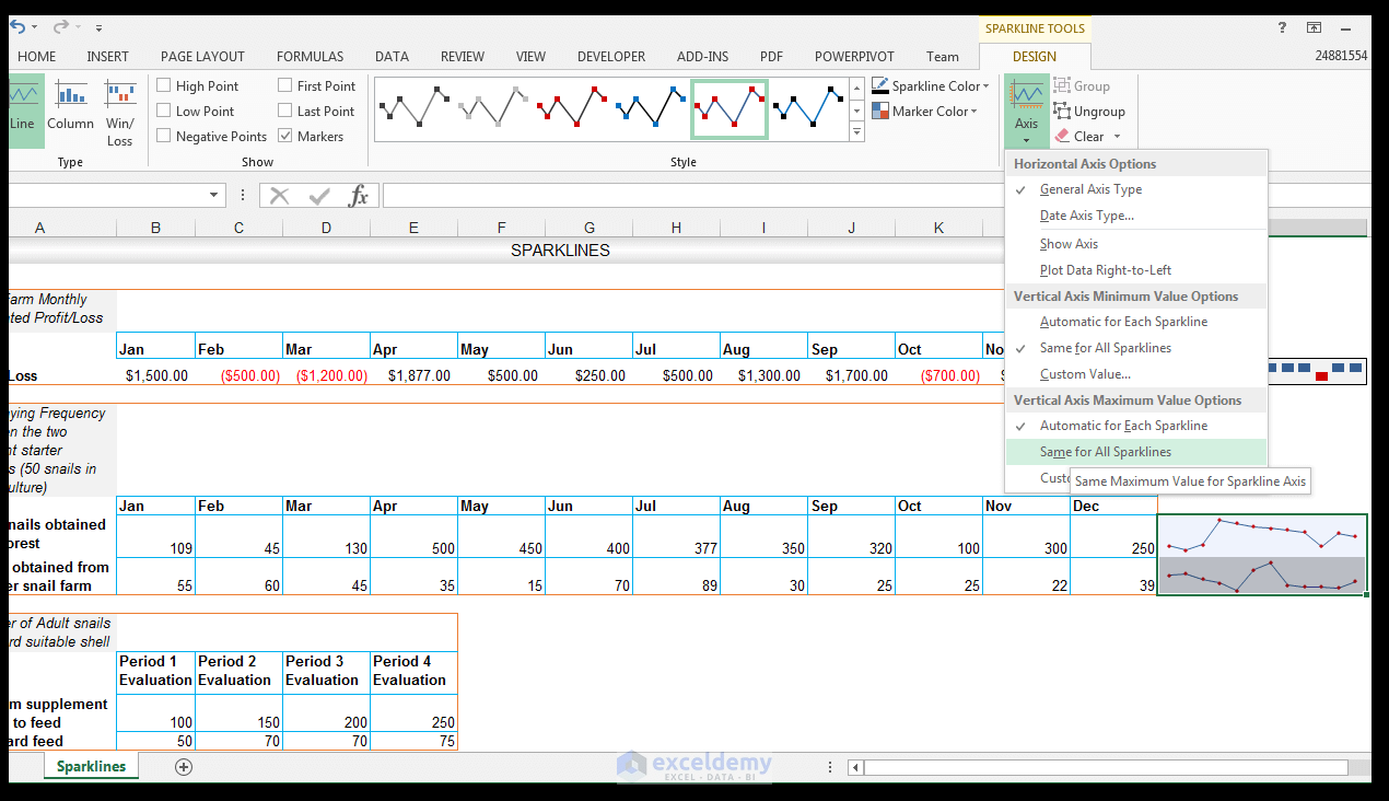
- The group of sparklines uses the same maximum and minimum benchmarks.
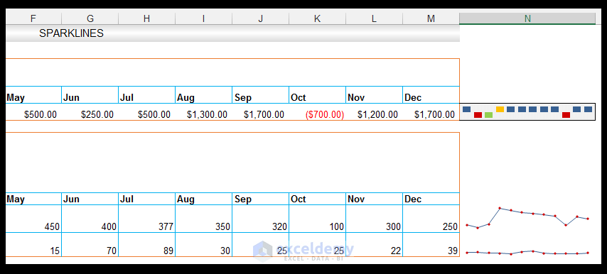
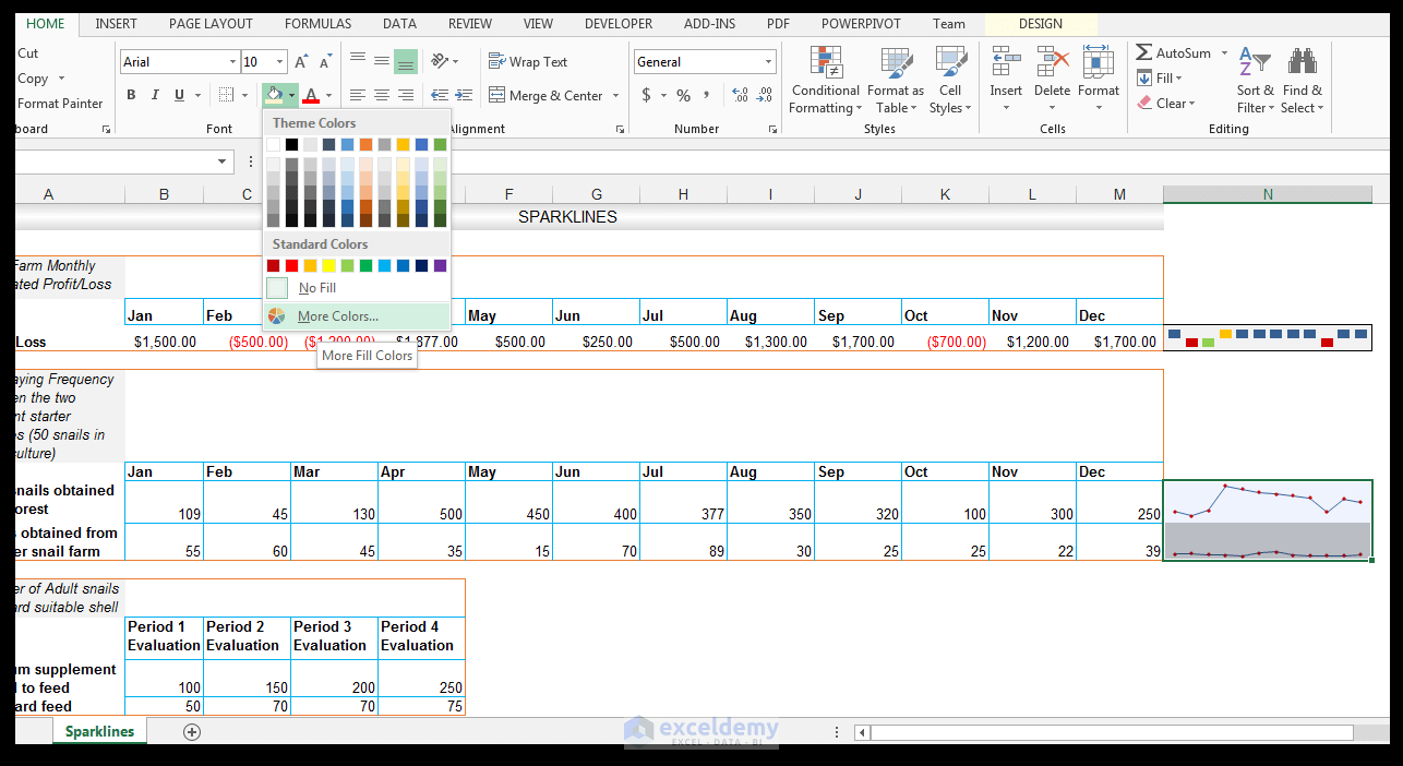
- Select the sparklines and select the Fill option in Home, then select More Colors as shown.
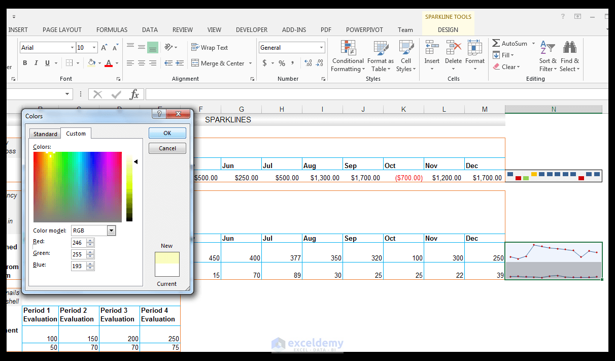
- Select the Custom tab, set the RGB to R 246, G 255, B 193, then click OK.
- Give the group a bottom border, a top border, and a right border as shown below.
Using Column Sparklines
Read More: 3D Referencing & External Reference in Excel
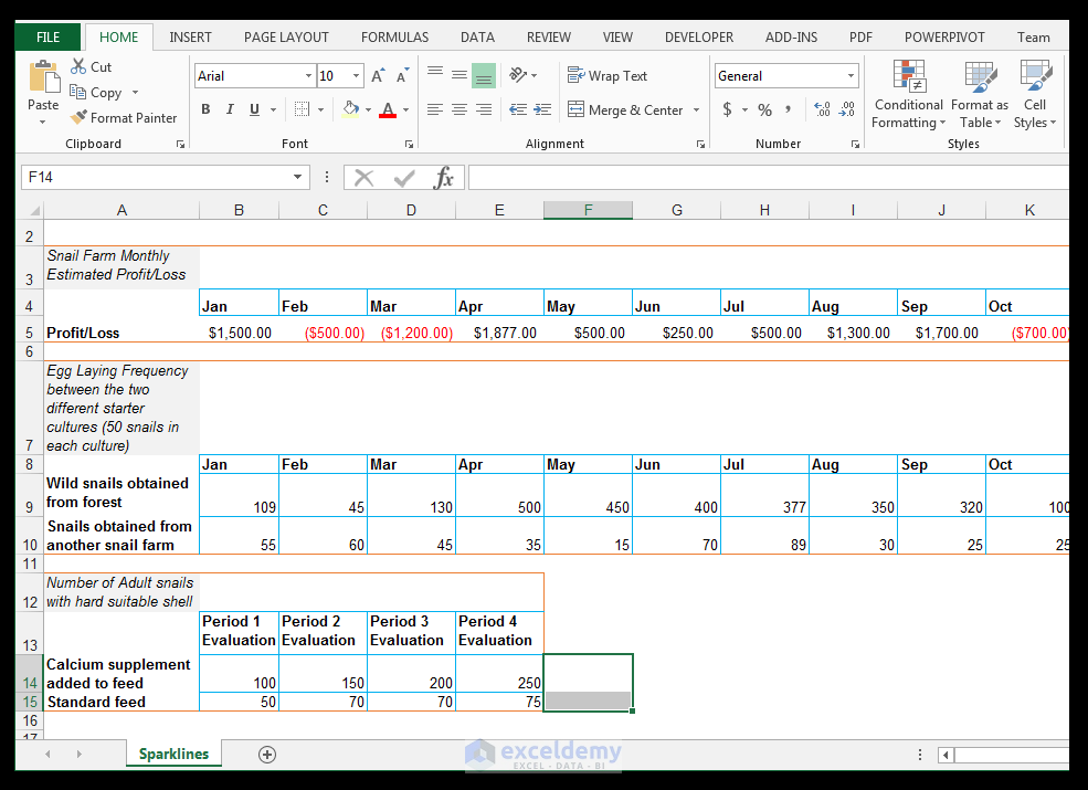
The farmer has two other separate sections of the snail farm divided, in order to test two different feeding regimes. In one section, the starter culture had an additional calcium supplement added to the feed, in another section (the same starter culture though) was fed using the standard feed. The number of adults that had hard shells subsequent to hatchling and juvenile phase, was then measured periodically in order to see whether or not the calcium supplements made a difference or not.
The shell hardness was used as an indication of the calcium the snails obtained. We want to see this output graphically using a column sparkline.
- Select cells F14:F15 as shown below.
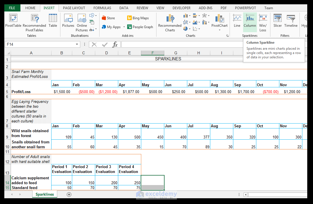
- Go to Insert and Sparklines then select Column Sparkline.
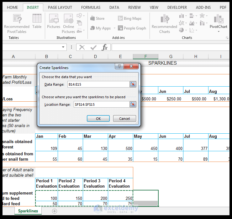
- For the data range, select the range B14:E15 as shown below.
- Click OK.
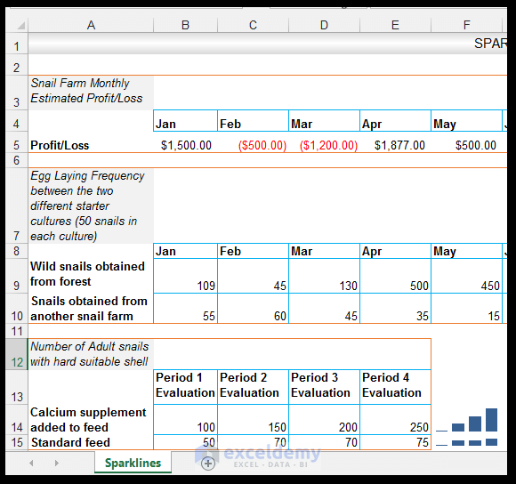
- The second sparkline in cell F15 is not displaying well with the current row height.
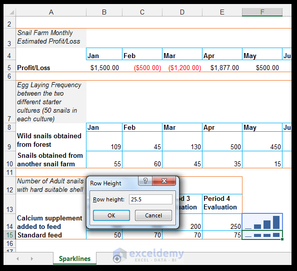
- Select cell F15, and go to Home and Cells, then click on the drop-down arrow under Format, and, under Cell Size, choose Row Height.
- Set the row height to 25.5 as shown below.
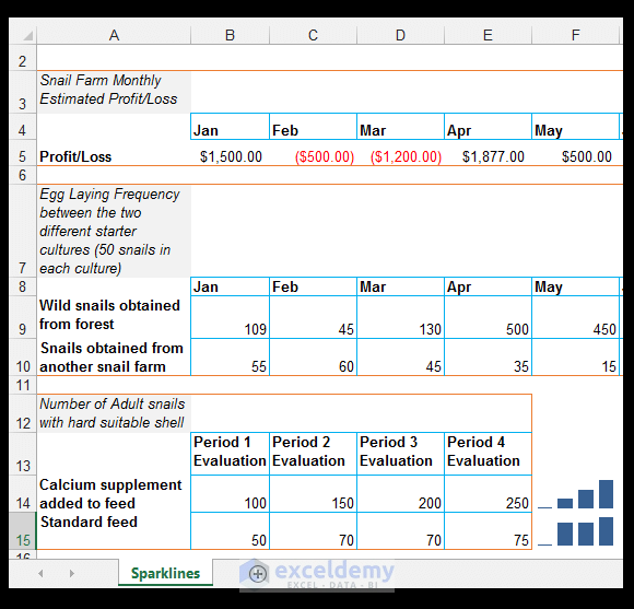
- Select cells F14:F15, go to Sparkline Tools > Design, then click on the drop-down arrow under the Axis.
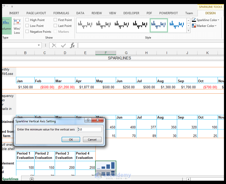
- For the Vertical Axis Minimum Value Options, choose Custom Value.
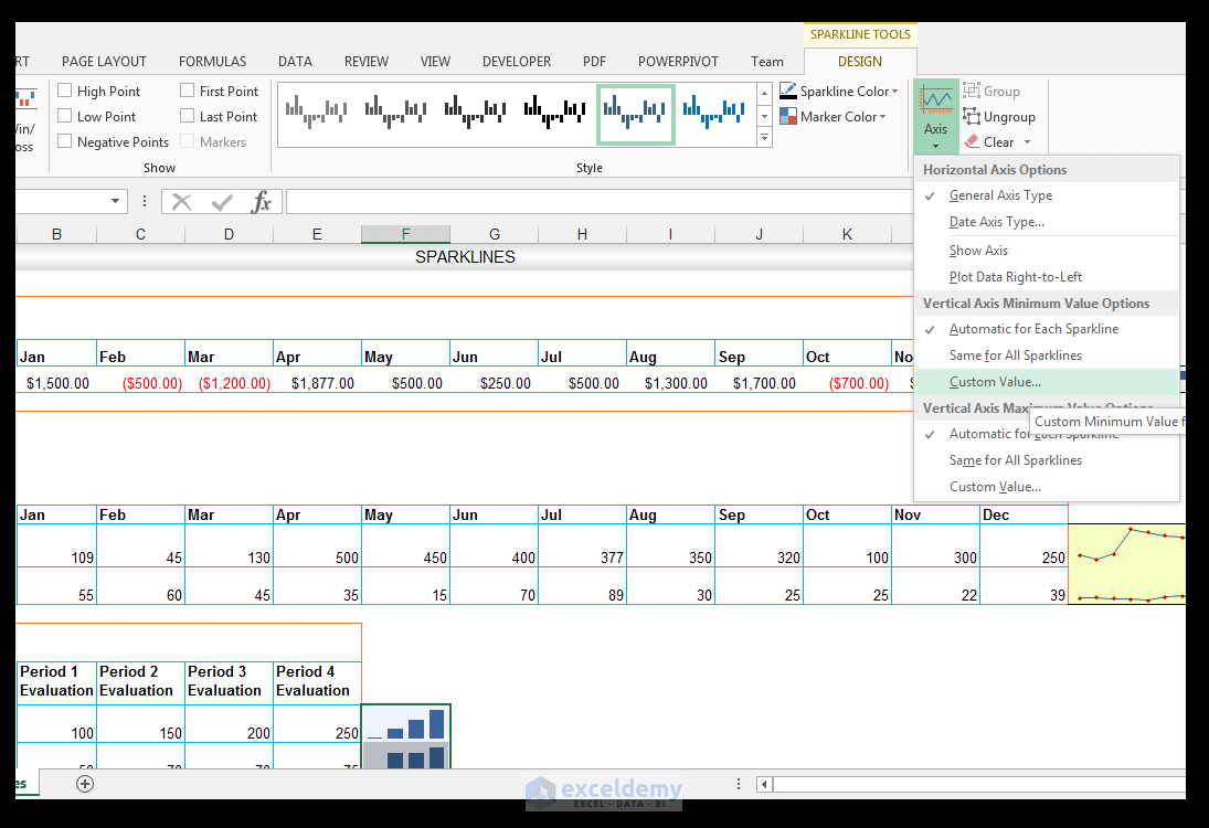
- Set 0.0 as the minimum value for the vertical axis and click OK.
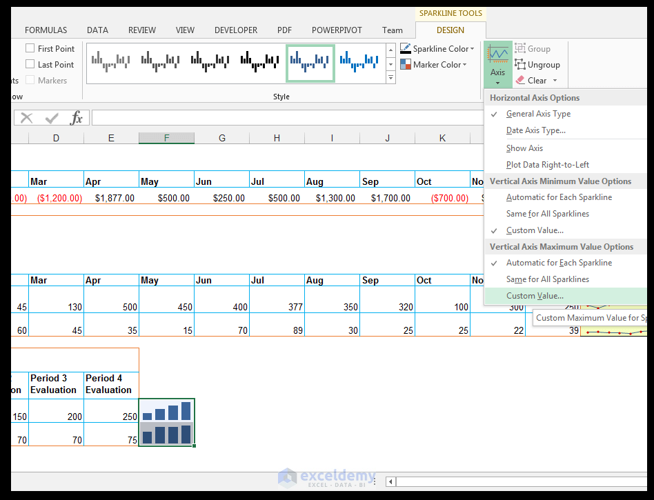
- Go to Sparkline Tools > Design, and click on the drop-down arrow under Axis.
- For the Vertical Axis Maximum Value Options, choose Custom Value.
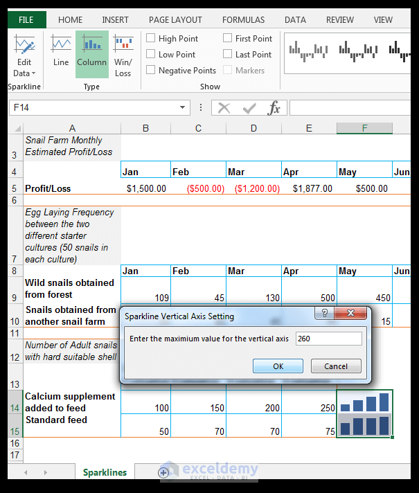
- Enter the maximum value as 260 as shown below and hit OK.
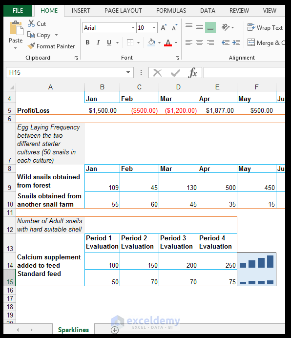
- Go to Home > Font and Fill with a light blue fill, in this case, Blue, Accent 1, Lighter 80%.
- Set a top, bottom, and right border as shown below.
Clearing or Deleting Sparklines
- Select the cell(s) containing the sparklines as shown below.
- Go to Sparkline Tools > Design and select Clear then choose Clear Selected Sparklines as shown below.
