Excel offers advanced chart techniques that help to transform complex data into easy-to-understand insights. In this article, we’ll use a practical example to demonstrate how to create a combination chart and customize visual elements to make your data stand out.
Let’s consider sample monthly sales data and profit percentages for a year, and you want to show these two metrics on one chart to illustrate the relationship between sales and profit trends.
1. Creating the Combination Chart
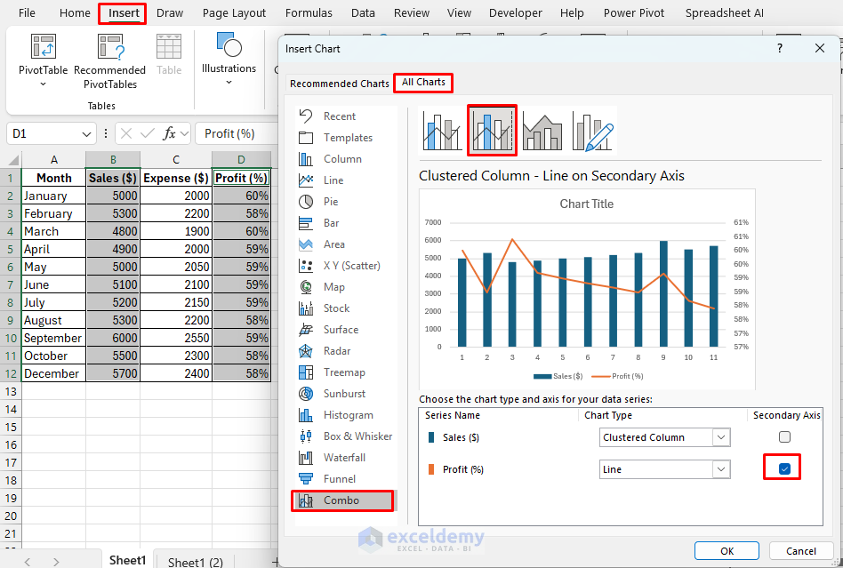
Let’s create a combination chart to visualize both sales and profit data in one chart. You will need to use a Clustered Column chart for sales and a Line chart for profit.
- Select the data to create the chart. Selected Sales and Profit column.
- Go to Insert tab >> from Combo Chart >> select Create Custom Combo Chart.
- In the Insert Chart dialog, choose Clustered Column for the “Sales” series and Line for the “Profit” series.
- Set the Secondary Axis for better visibility.
- Check the box for “Profit” under Secondary Axis to ensure it scales separately from the sales data.
- Click OK to insert the combination chart.

2. Customizing the Chart
Let’s customize the combination chart we just created for better visibility, readability, and impact.
- Select the chart.
- Open Chart Elements >> Add Chart Element >> Data Labels >>Center. To see exact values easily.
- You can customize the colors to distinguish sales and profit easily.
- Sales: Use a solid blue for the bars.
- Profit (%): Use a contrasting line color, like orange.
- Go to the Chart Design tab >> select suitable Chart Styles.
- Chart Styles offers ready-to-use formatted customized charts.
Output:

3. Applying Trendlines and Additional Visuals
To show overall trends, you can add a trendline to the profit data and an annotation for key insights.
- Right-click on the Profit (%) Line Series and select Add Trendline.

- Choose a Linear trendline to show the profit percentage trend over time.
- Select Display Equation to emphasize the profit trend numerically.

Add Text Box annotations to highlight key months or important values.
- Go to the Insert tab >> from Text >> select Text Box.

While adding trendline or other extra chart features try to remove data labels otherwise chart’s visualizations seem overcrowded.
Output:

4. Advanced Custom Visualizations
Excel offers advanced customization options as well as advanced charts.
Overlay Charts:
- Insert a chart type (e.g., Area chart).
- You can copy data from another chart type (e.g., Line) and overlay it on the existing chart.
- Adjust transparency and colors for each chart type to distinguish between data series.
Use Shapes and Icons:
- Add Shapes or Icons to emphasize specific data points or trends.
- Go to Insert tab >> from Shapes >> choose an oval or rectangle, and place it around the data points.
- Customize with colors, opacity, and size to integrate seamlessly with your chart.
Charting Tips:
- Follow less is more technique. Avoid overcrowding the chart with too many elements.
- Be consistent with color schemes for clear communication.
- Label your axes and legends clearly for easy interpretation.
Conclusion
Combination charts and custom visualizations in Excel help to present data with depth and clarity, making complex insights accessible at a glance. Combination charts with practical customizations create charts that effectively communicate your data’s story. Experiment with the techniques in your own datasets to enhance your data visibility and presentation.
Get FREE Advanced Excel Exercises with Solutions!

