When visualizing complex datasets in Excel, it’s crucial to choose the right type of chart to show insights effectively. Clustered and stacked bar charts both help visualize multi-dimensional data, but each serves a different purpose. In this article, we’ll show how to create clustered and stacked bar charts to visualize complex data in Excel. We will also show when to use each type with practical examples to help you decide which one suits your data best.
What Are Clustered and Stacked Bar Charts?
Clustered Bar Chart: It shows grouped data series side by side, allowing you to compare categories across different series. Each bar represents a distinct data series, which makes it ideal for comparing individual values.
Stacked Bar Chart: This represents data series stacked on top of each other within the same bar, showing the cumulative contribution of each series to the total. This chart is best for understanding part-to-whole relationships across categories.
Both charts help to make complex datasets visually manageable, but the right choice depends on the data’s structure and the insights you need to present.
Creating Clustered Charts in Excel
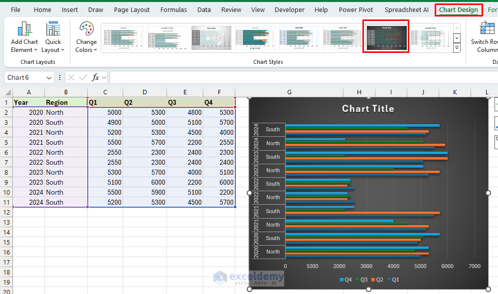
Consider quarterly sales data for years in two regions. Now, prepare your data in a tabular format with proper column headers. This dataset will showcase both overall trends and detailed category comparisons.
- Select data including headers for the chart.
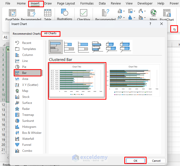
- Go to the Insert tab >> from All Charts >>select Bar Chart >> select Clustered Bar >> click OK.

Output:

You can see all the information is not visible in the chart. Let’s customize the chart.
- As Excel offers advanced built-in chart styles. You can select any chart style best suited for your dataset.
- We selected Chart Styles from the Chart Design tab.
- Next, enlarge the chart to show all the contents of the chart.

Chart Insights:
Regional Comparison: You can see direct comparisons between the North and South regions for each quarter. For example, in Q1 2023, the North region outperformed the South, while in Q3 2024, the South’s sales exceeded the North’s.
Quarterly Performance Trends: This chart reveals fluctuations in quarterly sales within each year for both regions. For instance, South consistently shows higher Q4 sales across most years, while North shows relatively stable but lower Q3 sales in some years (like 2021).
Creating Stacked Bar Chart in Excel
For a similar dataset let’s create a stacked bar chart in Excel.
- Select data including headers for the chart.
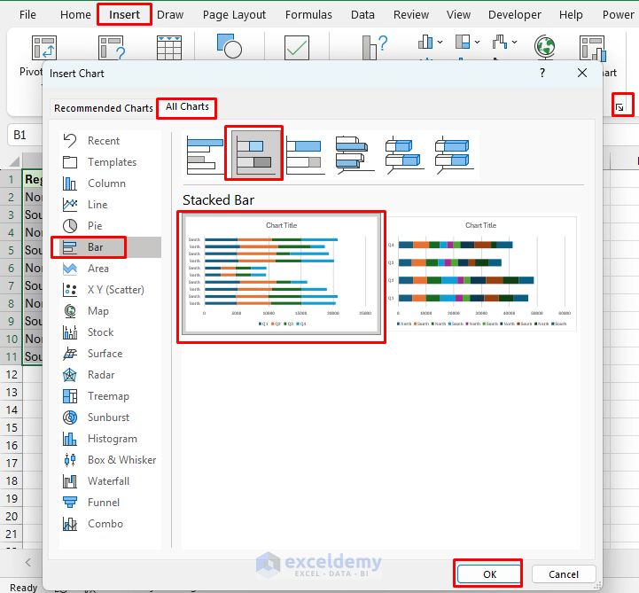
- Go to the Insert tab >> from All Charts >>select Bar Chart >> select Stacked Bar >> click OK.

Output:

- We selected similar Chart Styles from the Chart Design tab.

Chart Insights:
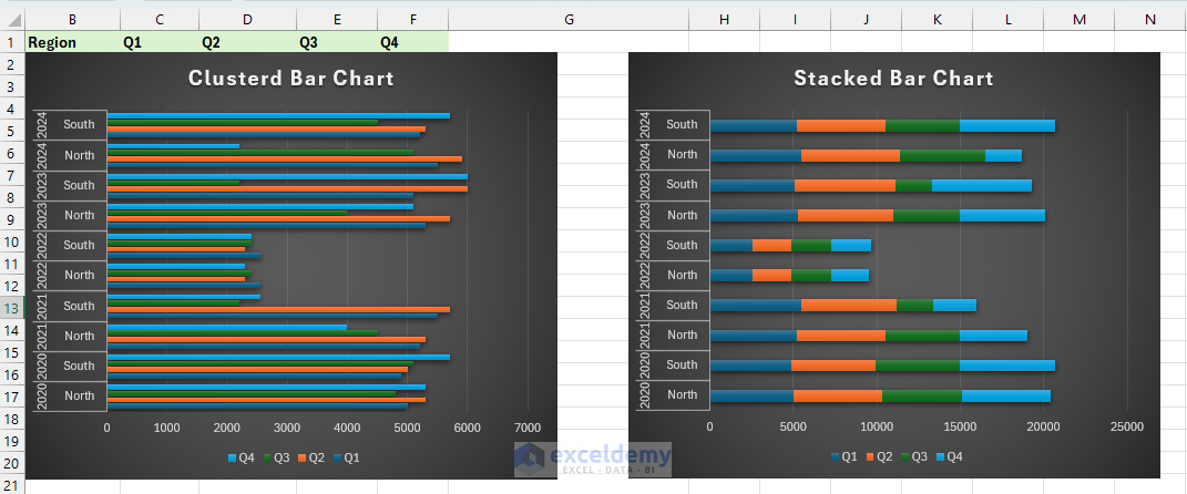
Total Sales Overview: This chart highlights total sales per quarter each year, with clear visibility on how each region contributes to the cumulative sales. For example, Q4 2023 has a high total, with South contributing significantly.
Proportional Insights: It shows the proportion of sales between North and South within each quarter. For instance, Q1 and Q2 in 2024 have almost balanced contributions from both regions, while Q4 2024 is dominated by the South.
Advanced Customization Tips for Complex Data
- Dynamic Data Labels: Add data labels that show values or percentages to provide context for each series.
- Secondary Axis: If one quarter’s sales dominate, consider adding a secondary axis to balance the scale.
- Legends and Titles: Label each axis and add a clear title that describes the insight.
- Color Coding for Trends: Use color gradients or shades to indicate performance changes over time.
Comparison of Clustered and Stacked Charts for Complex Data
Clustered Bar
- Best for direct comparison of values across categories.
- It becomes cluttered with many data points that can make trends unclear.
- You can use it to compare quarterly sales for each product by region to highlight regional performance.
Stacked Bar
- Best for part-to-whole analysis within each category.
- It is harder to compare individual series when values are similar.
- You can use it to view each product’s percentage contribution to total regional sales, spotting trends in market share over time.
Here is the side-by-side comparison of both charts. You can make your decisions from the chart,

A clustered bar chart will be better if you want to directly compare quarterly sales between the North and South regions each year. A stacked bar chart will be better if you want to see overall quarterly sales per year with the regional contributions to each total.
Conclusion
Both clustered and stacked bar charts are important for different types of data visualization. Choose a clustered chart for direct comparisons across categories and a stacked chart for part-to-whole insights within each category. By mastering both, you’ll enhance your ability to communicate complex data insights clearly in Excel. Try to explore both charts to decide which one will suit your data best.
Get FREE Advanced Excel Exercises with Solutions!

