Dataset Overview
To display formatted data labels in Excel, follow these steps using the below dataset that includes country names and their corresponding sales amounts for fruits and vegetables:
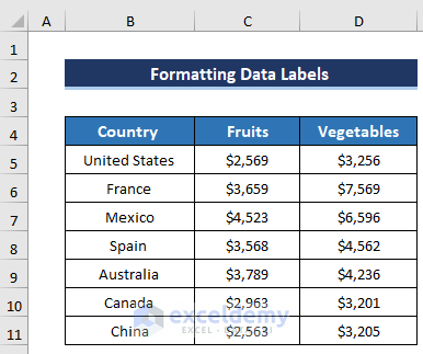
Step 1 – Creating a Chart in Excel
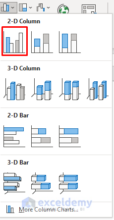
- Go to the Insert tab in the ribbon.
- From the Charts group, select the Column chart option.

- Choose the first chart from the 2-D Column section.
- Add data to create your desired chart.
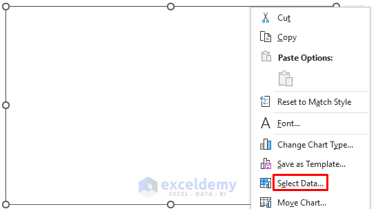
- Right-click on the blank chart and select Select Data.
-
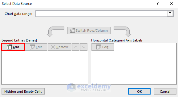
- In the Legend Entries section, click on Add.
-
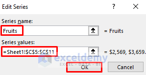
- The Edit Series dialog box will appear.
- Set a Series name and define the Series values.
- We define the Fruits column as Series Values.
- Click on OK.
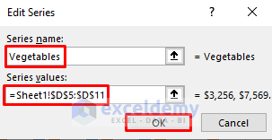
- Add another series called Vegetables.
- Define column D as Series Value.
- Click on OK.
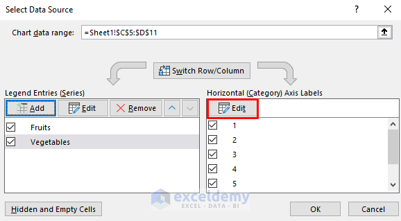
- In the Select Data Source dialog box, click on the Edit option from the Horizontal Axis Labels.
-
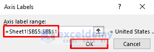
- In the Axis Labels dialog box, select column B as the Axis label range.
- Click on OK.
-
- Click on OK in the Select Data Source dialog box.
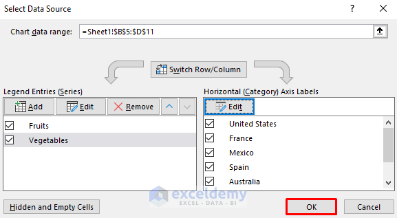
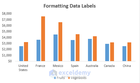
The following chart will display.
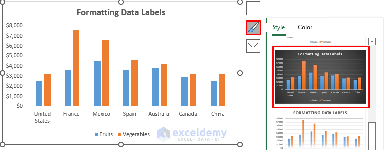
- To modify the Chart Style, click on the Brush sign on the right side of the chart.
- Select any of your preferred chart styles.
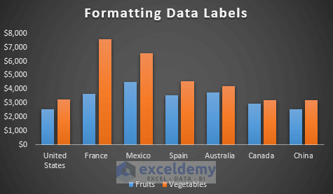
As a result, the following chart will display as a final solution.
Step 2 – Adding Data Labels to Excel Chart
- Right-click on any column in the Vegetables series.
- Select Add Data Labels.
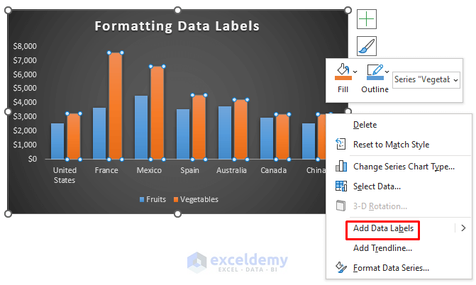
- It will add data labels to all the columns of the Vegetables series.
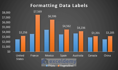
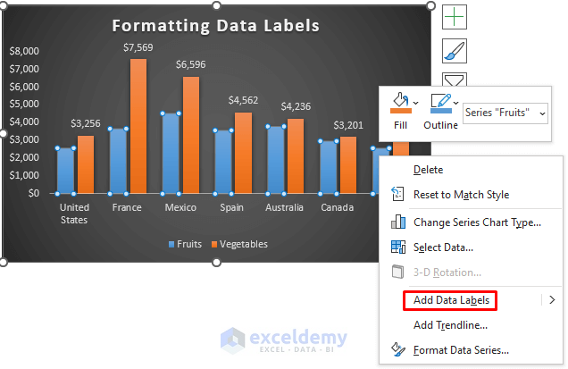
- Repeat the same process for the Fruits series.
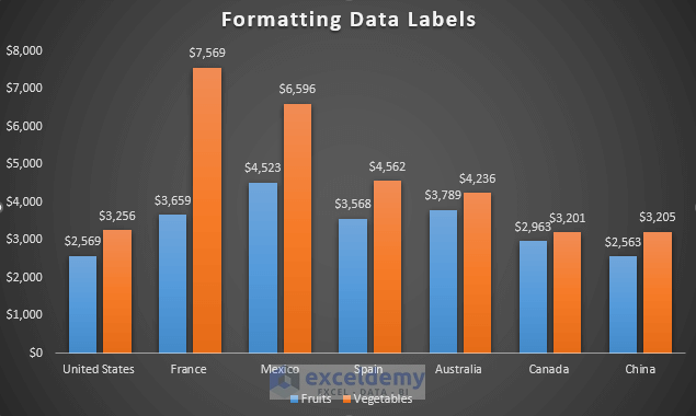
- Data labels will appear on all columns.
Read More: How to Add Additional Data Labels to Excel Chart
Step 3 – Modifying Fill and Line of Data Labels
- Right-click on any data label.
- Choose Format Data Labels.
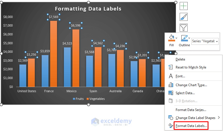
- In the Format Data Label dialog box:
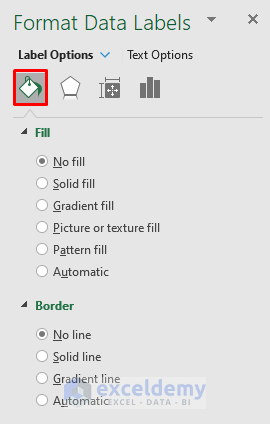
-
- Modify the fill (e.g., change from No fill to Solid fill or Gradient fill).
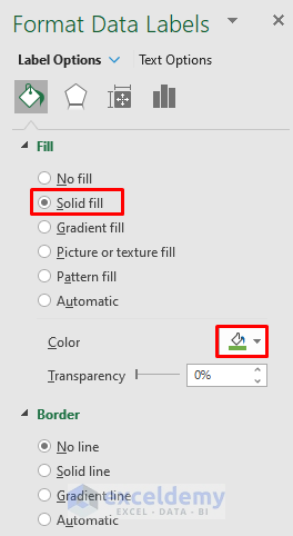
As a result, we have the following chart.
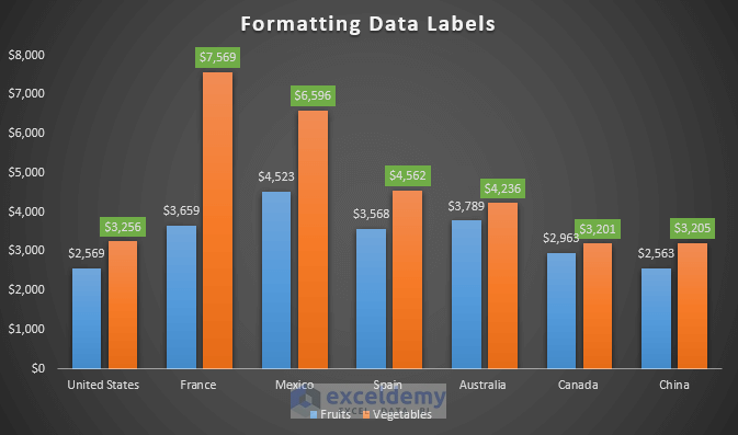
-
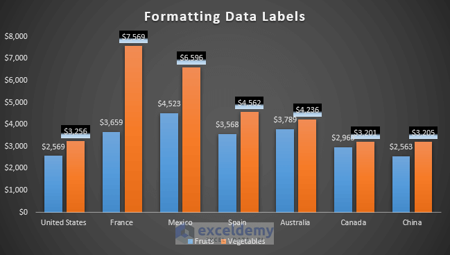
- Change the Fill from Solid fill to Gradient fill.
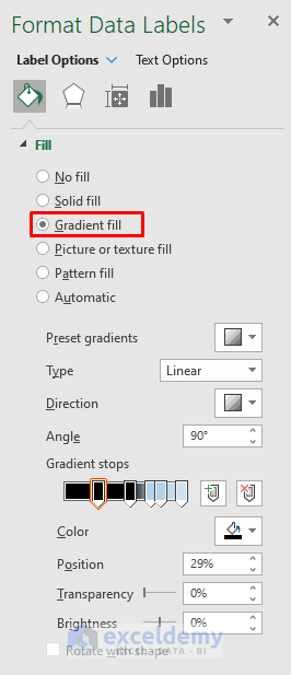
It will give us the following result in the chart.
-
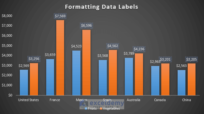
- Change Fill from Solid fill to Picture or texture fill.
- Also change the texture color from the Color section.
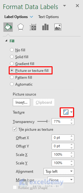
As a result, we get the following results in the chart.
-
- Adjust the border (e.g., change from No line to Solid line or Gradient line).
- You can also change the Color and Width of the border.
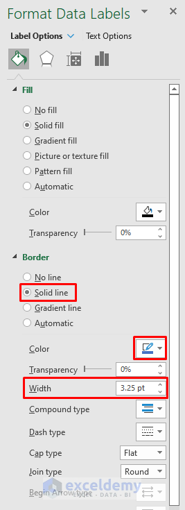
We will get the following result.
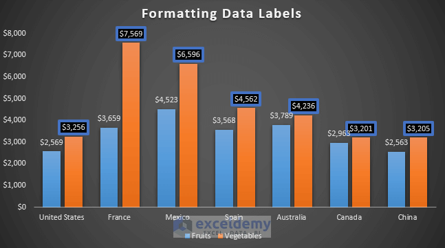
-
- Change the border from a Solid line to a Gradient line.
- You can also change the Color and Width of the border.
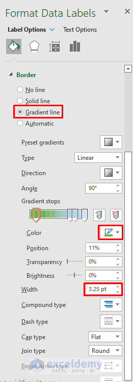
We will get the following result.
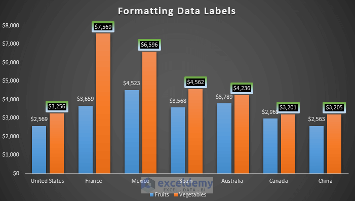
Read More: How to Edit Data Labels in Excel
Step 4 – Formatting Data Labels by Changing Effects
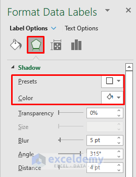
- In the Effects section of the Format Data Labels dialog box:
- Modify the shadow option to create a shadow effect on the data labels.
- Adjust the preset and color of the shadow.
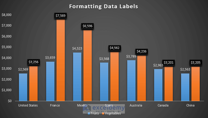
As a result, we will get the following results.
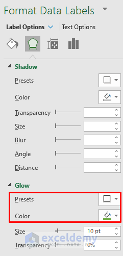
- Explore the glow section by changing presets, colors, and setting the size (e.g., 10).
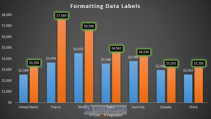
It will give the following result with the glow.
Read More: How to Change Font Size of Data Labels in Excel
Step 5 – Modifying Size and Properties of Data Labels
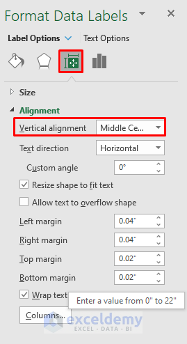
- Click on the third option in the Format Data Labels dialog box to modify alignment.
- Change the vertical alignment to Middle centered to position data labels in the center.
- You can choose other alignment options like top, bottom, middle, top centered, or bottom centered.
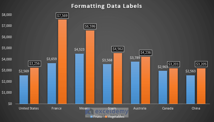
It will give the following results.
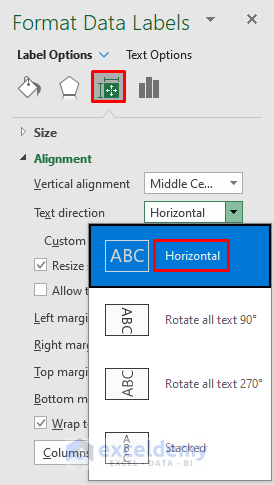
- Adjust the text direction (horizontal, rotate 90 degrees, or rotate 270 degrees) using the Text direction dropdown.
Read More: How to Rotate Data Labels in Excel
Step 6 – Modifying Label Options to Format Data Labels in Excel Chart
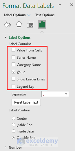
- Go to the fourth option in the Format Data Labels dialog box (label options).
- In the Label Options section:
- Modify the label contains (include series name, category name, and value).
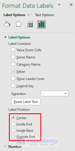
- Set the label position (default is outside end; try center, inside end, or inside base).
-
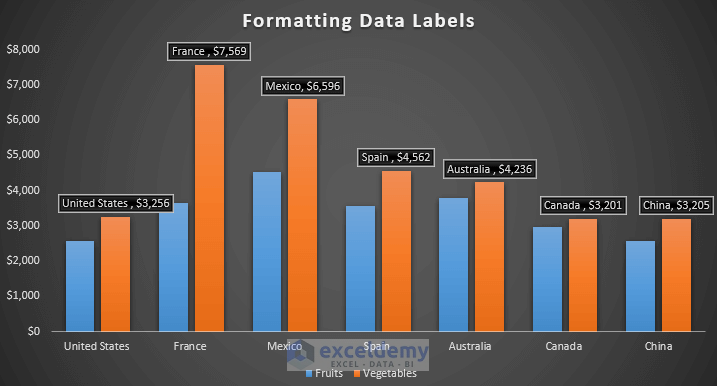
- We include the category name and value of the labels.
As a result, we will get the following results.
-
- In the Label Position section, by default, we have an outside end label position.
- Set it in the center, inside end, or inside the base.
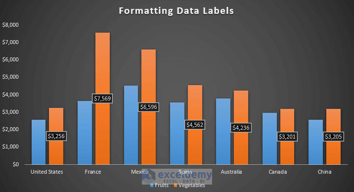
If we set the label position in the center, we will get the following results.
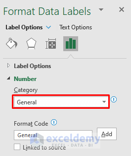
- Use the Numbers section to convert data labels into different formats (e.g., currency, general, number) by changing the category.
Download Practice Workbook
You can download the practice workbook from here:
Related Articles
- How to Remove Zero Data Labels in Excel Graph
- How to Move Data Labels In Excel Chart
- How to Hide Zero Data Labels in Excel Chart
- [Fixed:] Excel Chart Is Not Showing All Data Labels
<< Go Back To Data Labels in Excel | Excel Chart Elements | Excel Charts | Learn Excel
Get FREE Advanced Excel Exercises with Solutions!

