A pie chart is used to showcase parts of a whole or the proportions of a whole.
We will use a simple tennis related example to illustrate how to effectively use a pie chart and add rich data labels to your chart.
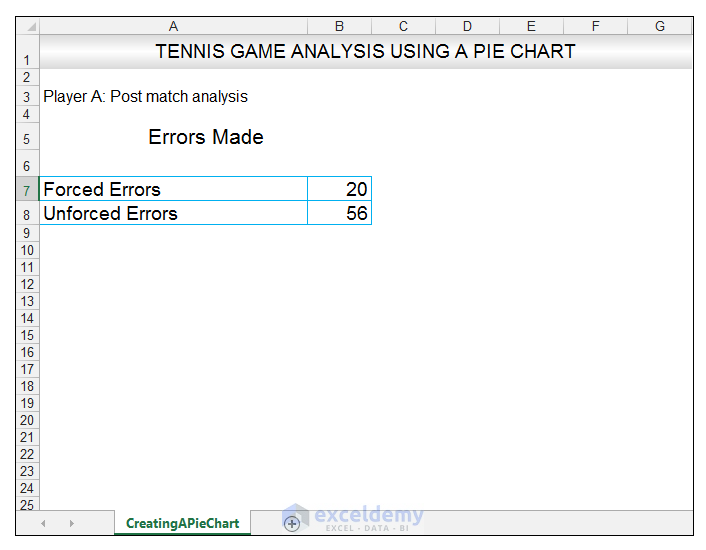
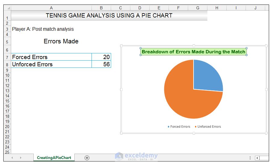
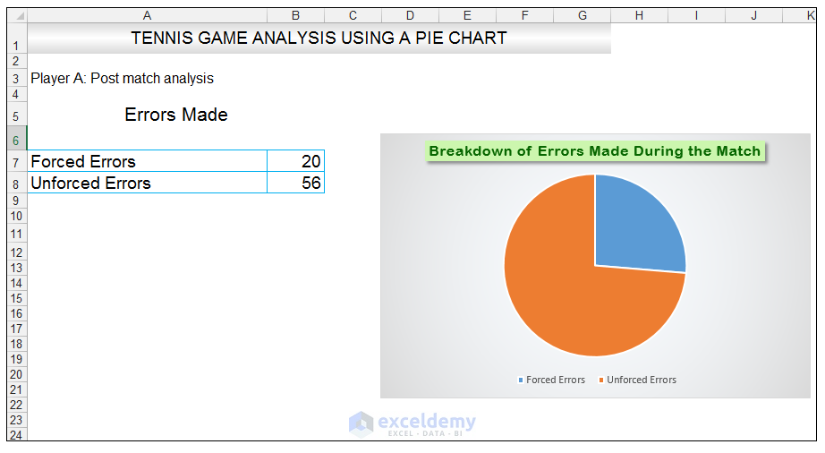
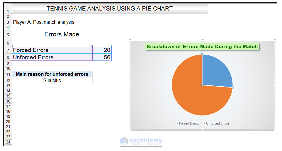
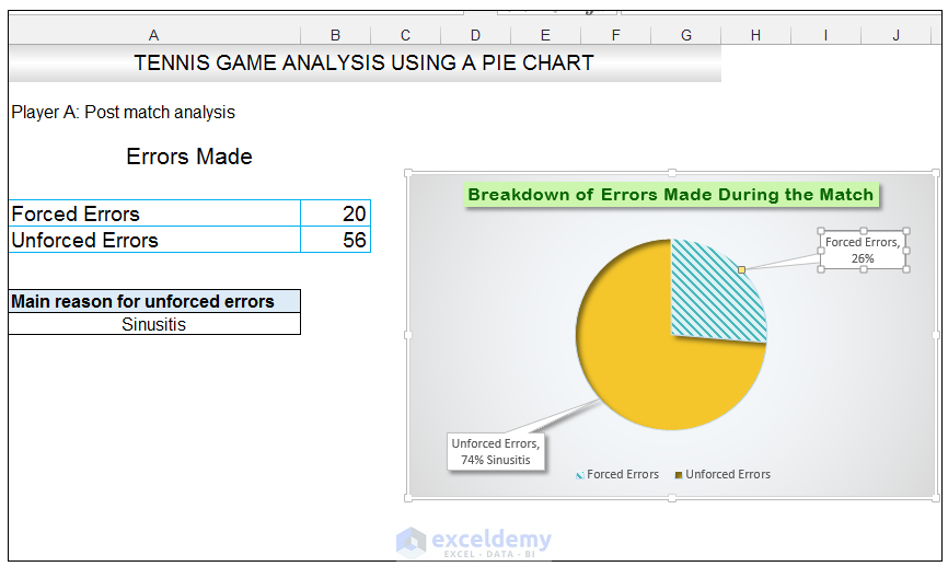
A tennis coach at a hypothetical tennis clinic is evaluating the post-game performance of his top-seeded player. He wants to visually present the main types of errors the player made along with the unforced errors. We will combine these two errors in a pie chart.
The source data is shown below:
Method 1 – Creating and formatting the Pie Chart
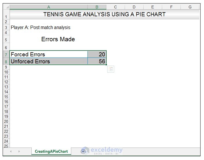
- Select the data.
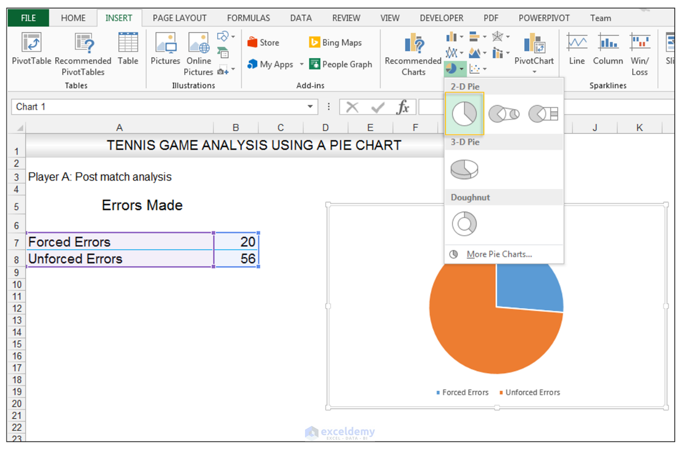
- Go to Insert> Charts> click on the drop-down arrow next to Pie Chart and under 2-D Pie, select the Pie Chart.
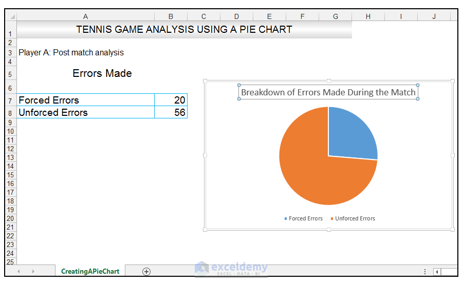
- Change the chart title to Breakdown of Errors Made During the Match, by clicking on it and entering the new title.
- With the chart title still selected, go to Home>Font>click on the drop-down arrow next to fill, and select More Colors as shown below.
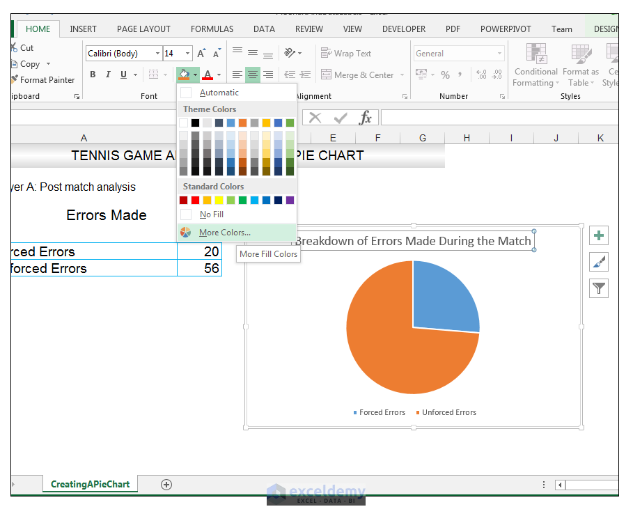
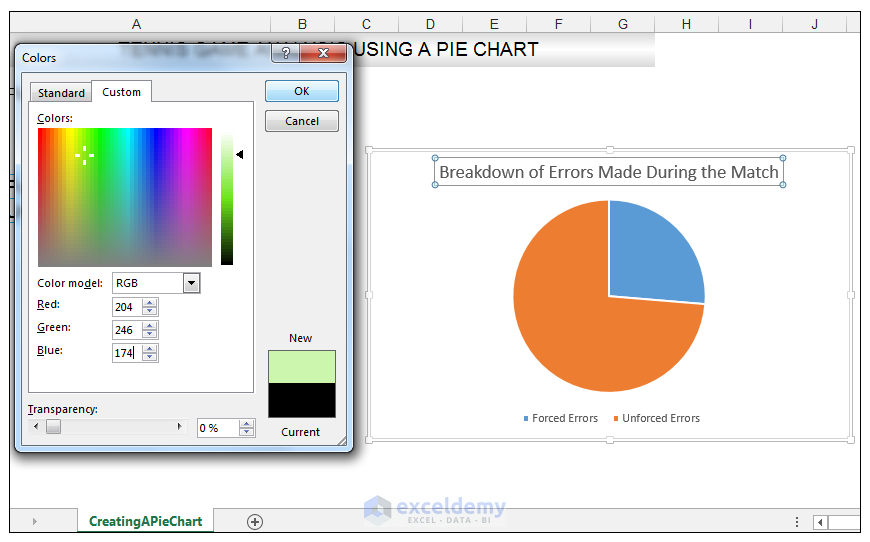
- Select the Custom Tab, from the Colors Dialog box ,enter R 204, G 246, B 174 to fill the background of the title with this light green color.
- Click Ok.
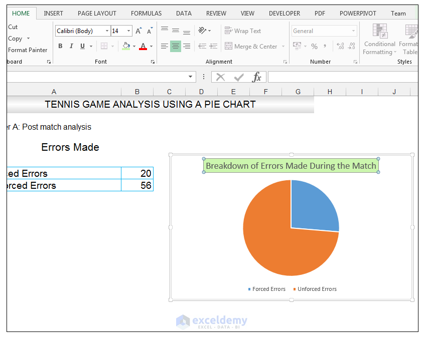
- With the title still selected, go to Home>Font and change the font to Arial Rounded MT Bold, and the font size to 12.
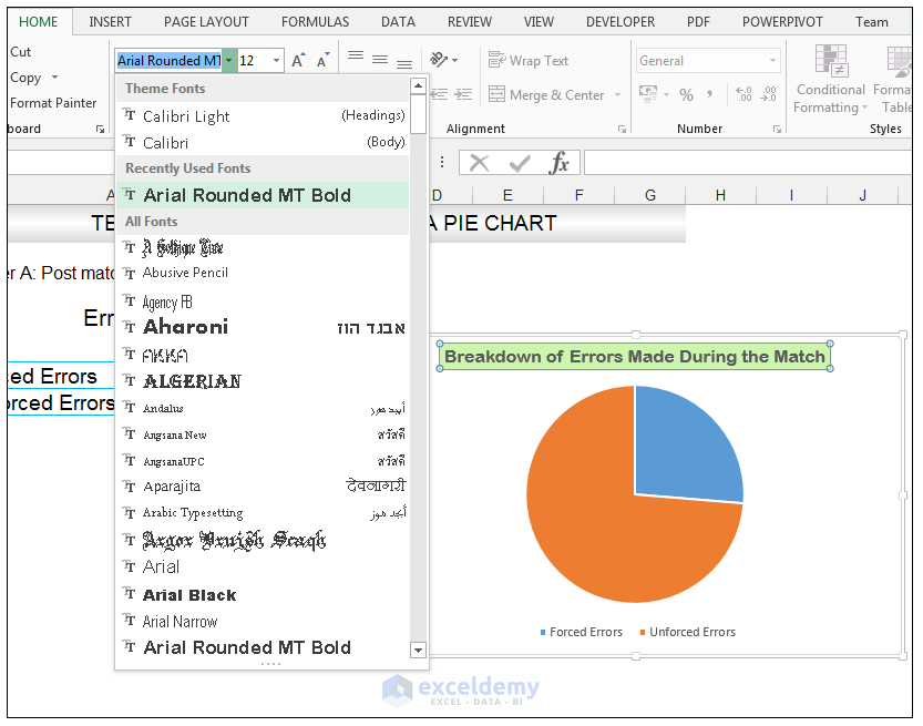
- Change the font color of the chart title to R 7, G 102, B 0.
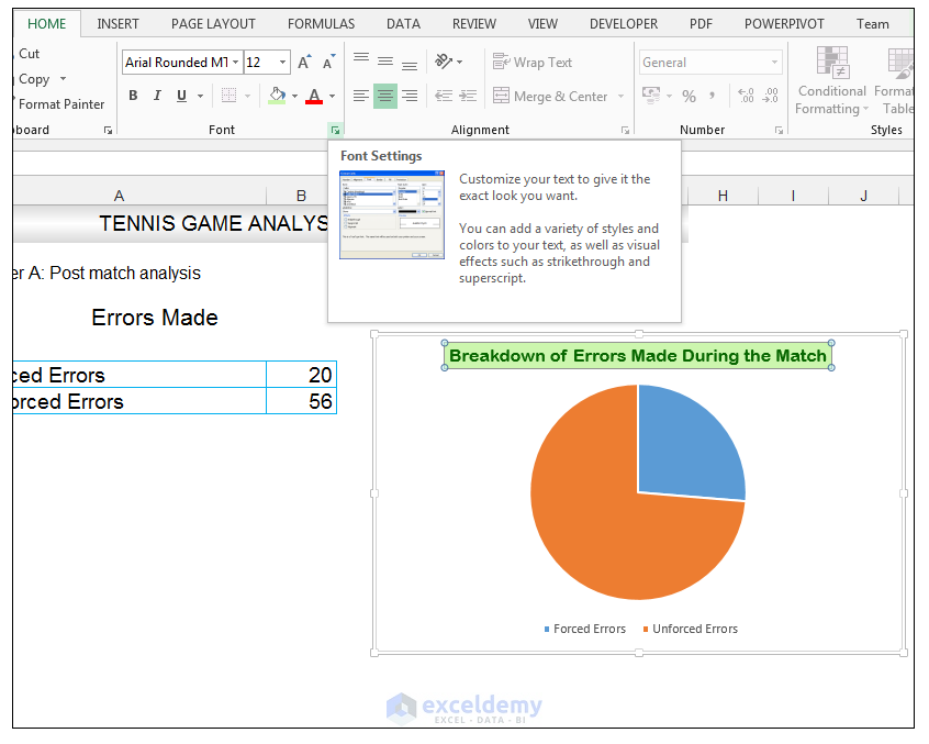
- With the chart title still selected, go to Home>Font and expand the Font section, in order to launch the Font Dialog box.
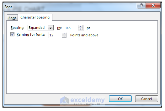
- Select the Character Spacing Tab and change the spacing to expanded by 0.5 points.
- Click Ok.
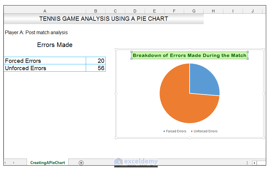
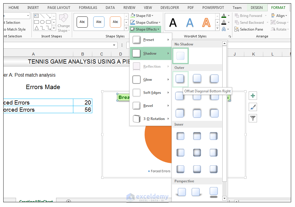
- With the chart title still selected, go to Chart Tools>Format>Shape Styles and click on the drop-down arrow next to Shape Effects, select Shadow>Outer>Offset Diagonal Bottom Right.
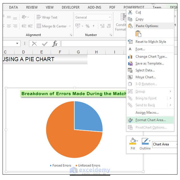
- With the actual chart selected, right-click the chart and choose Format Chart Area.
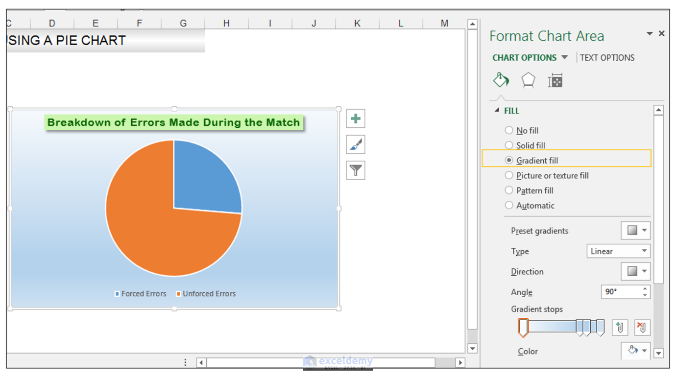
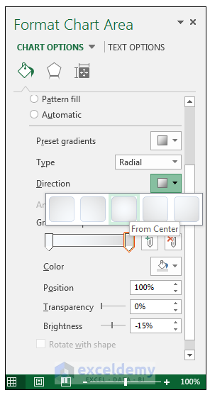
- In the Format Chart Area Panel, go to Chart Options and check the Gradient fill option.
- With the Format Chart Area Panel still open, go to the gradient stops section and click on stop 2 of 4, and select delete gradient stop.
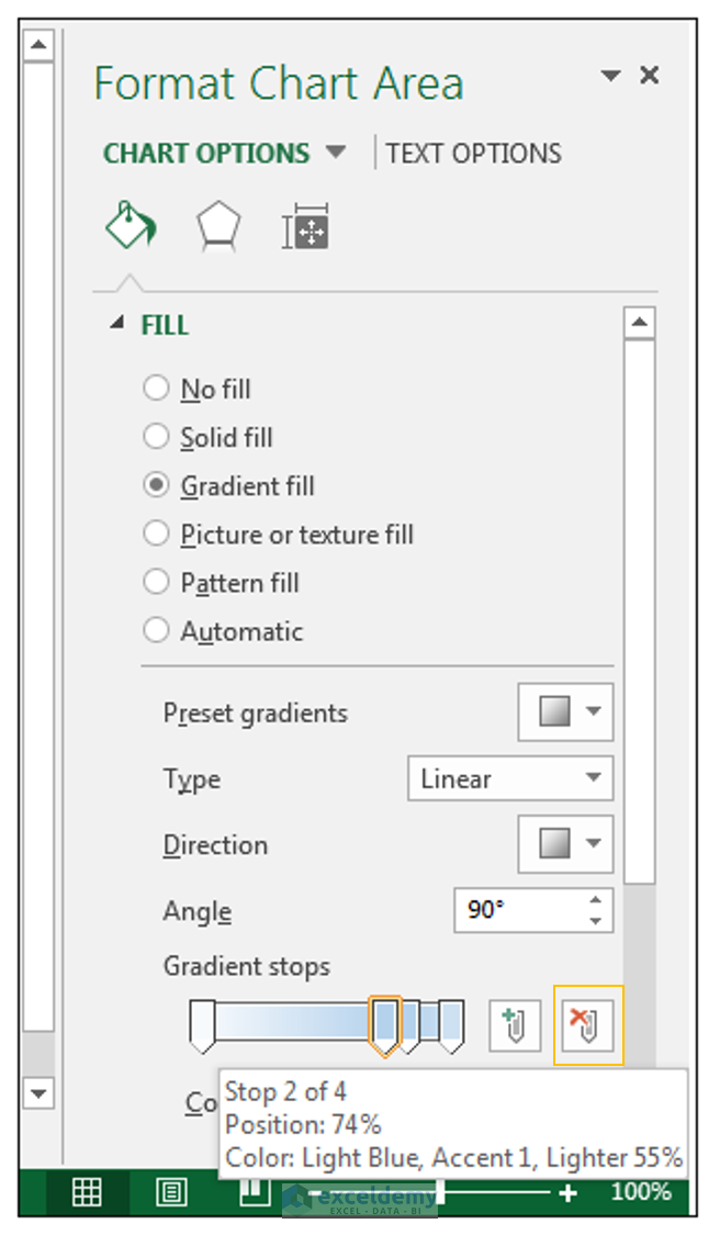
- Do the same thing for the remaining stop in the middle and delete it.
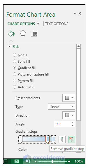
- Only two gradient stops are remaining, so select Stop 2 of 2 as shown below.
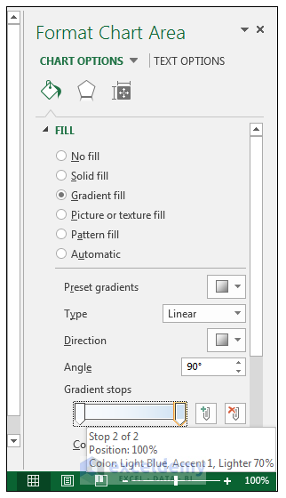
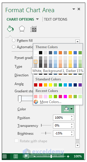
- Fill this stop with the White, Background 1, Darker 15% fill.
- Change the Gradient Type to Radial.
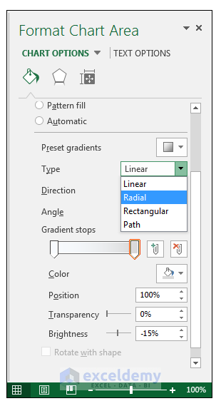
- Change the Direction to From Center.
- Close the Format Chart Area Panel.
Method 2 – Formatting the Data Labels of the Pie Chart
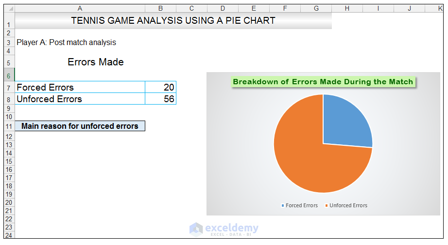
- In cell A11, enter the following text, Main reason for unforced errors, and give the cell a light blue fill and a black border.
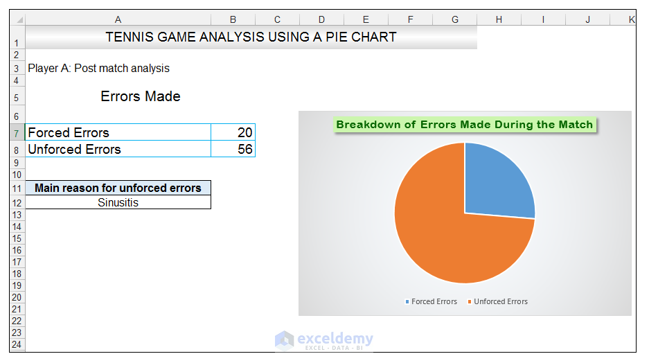
- In cell A12, enter the text Sinusitis, and give the cell a black border, and align the text to the center position.
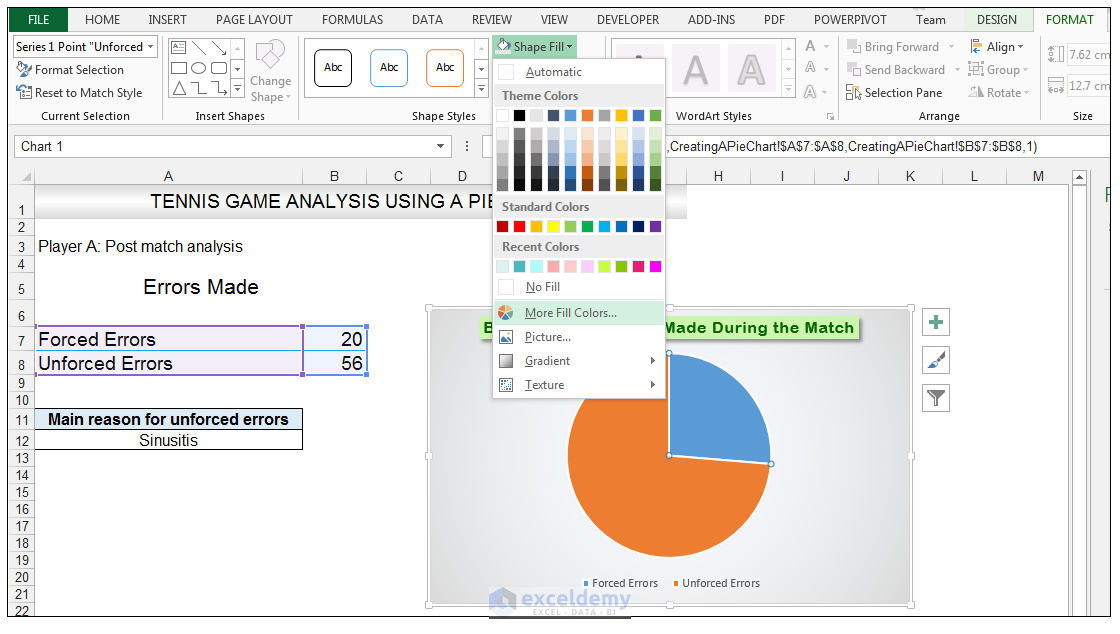
- Select the Unforced Errors data point only, (the currently orange shaded data point), since we want to format this particular data point with specific formatting.
- Go to Chart Tools>Format>Shape Styles>Click on the drop-down next to Shape Fill and select More Fill Colors.
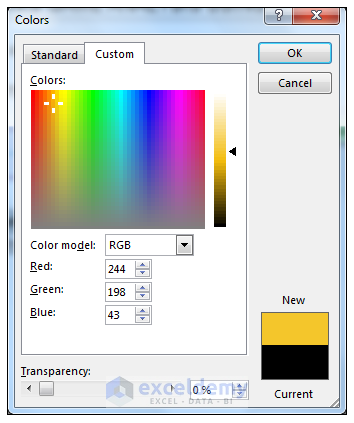
- Select the Custom Tab, from the Colors Dialog Box, and enter the following values R 244, G, 198, B 43 and click Ok.
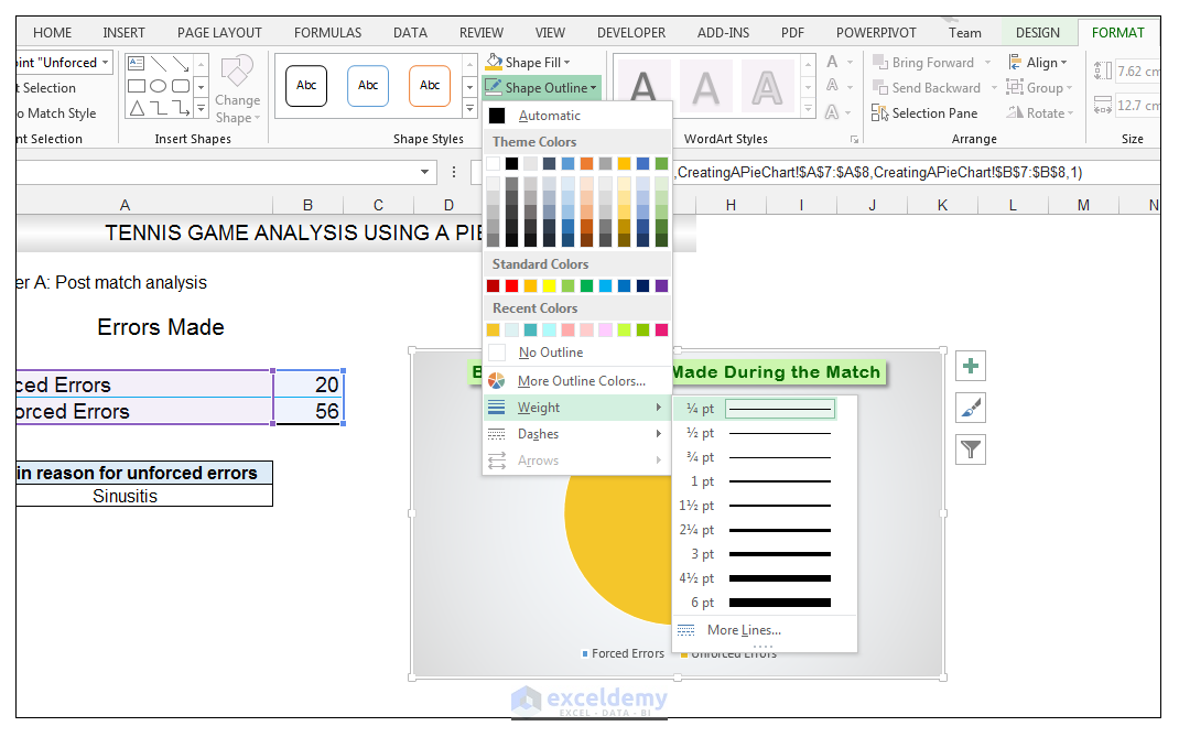
- With the data point still selected, go to Chart Tools>Format>Shape Styles and click on the drop-down arrow next to Shape Outline and select Weight and change the weight of the outline to ¼ points as shown below.
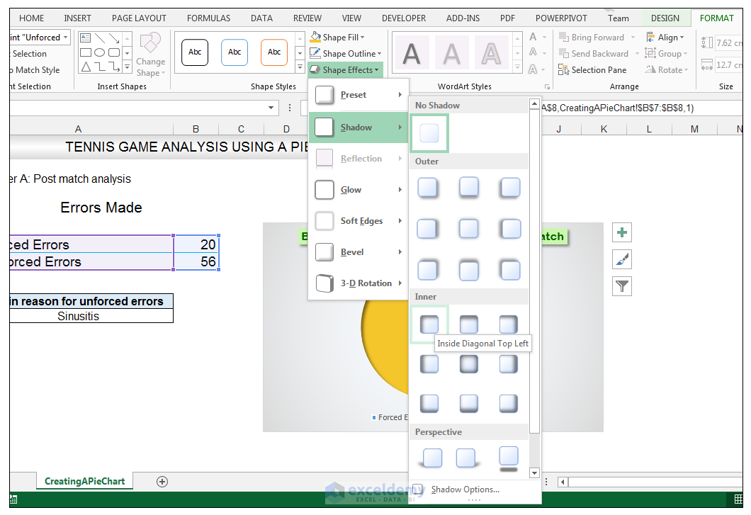
- With the data point still selected, go to Chart Tools>Format>Shape Styles and click on the drop-down arrow next to Shape Effects and select Shadow and choose Inner Shadow>Inside Diagonal Top Left.
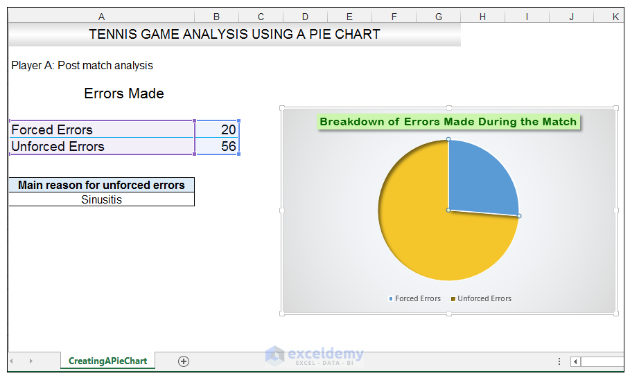
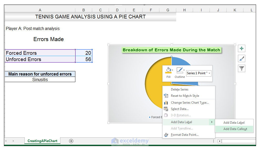
- With the one data point still selected, right-click this data point, and select Add Data Label>Add Data Callout.
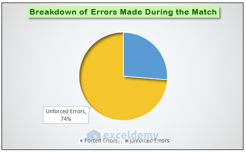
- Select only this data label and right-click and choose Insert Data Label Field.
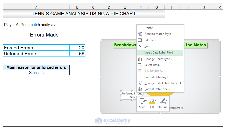
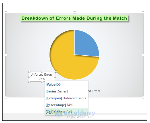
- Select [Cell] Choose Cell from the options.
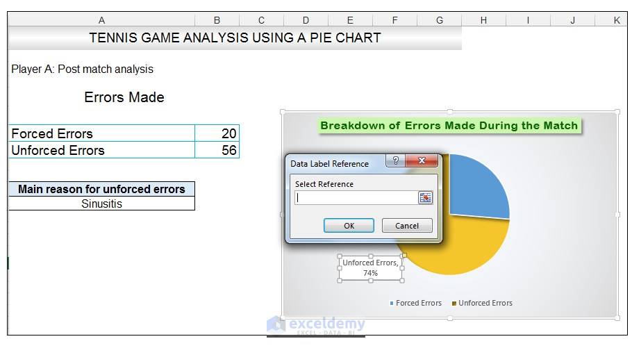
- Select the cell reference, which in this case is cell A12, so that if one changes the value in cell A12, the Data Callout will update based on the value in this cell.
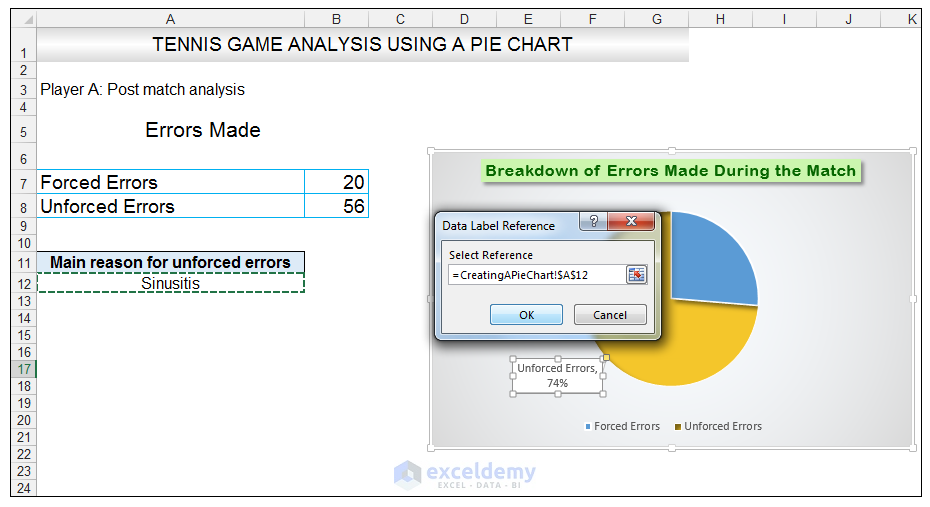
- Select the Data Callout and position it slightly to the left by just dragging it, and add a space between 74% and Sinusitis.
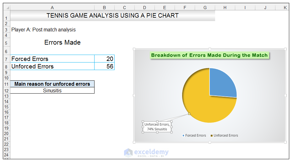
- With the Data Callout Selected, go to Chart Tools>Format>Shape Styles and click on the drop-down arrow next to Shape Effects and select Shadow and choose Outer Shadow Offset Diagonal Bottom Right.
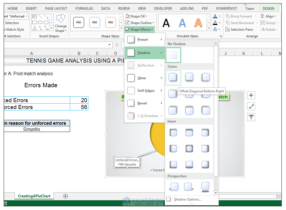
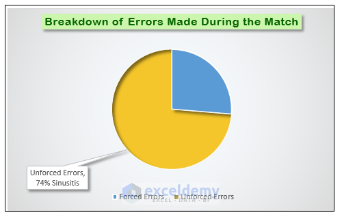
- Select the other data point solely and right-click and select Format Data Point.

- In the Format Data Point Panel, select Fill.
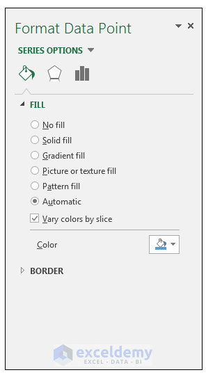
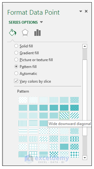
- Instead of Automatic, choose Pattern fill, and select the Wide downward diagonal pattern.
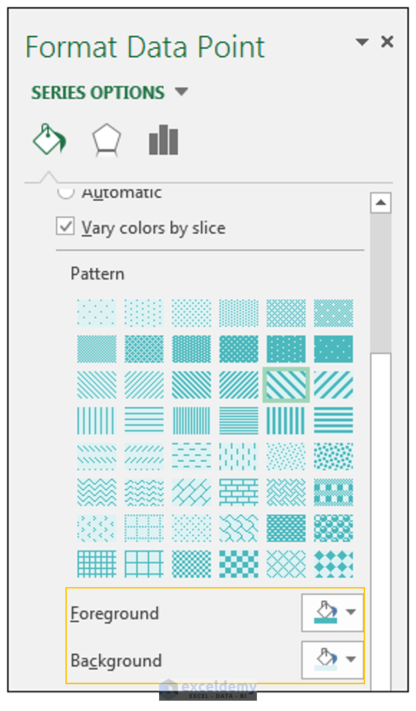
- Change the foreground color of the pattern to R 74, G 184, B 189, and the background color to R 222, G 242, B 243.
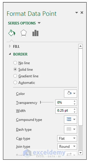
- Expand the border section, with the data point still selected, and change the width of the border to 0.25 points.
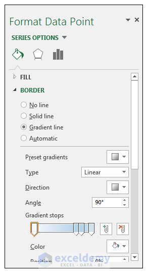
- Select gradient line, instead of Automatic.
- Close the Format Data Point panel, and add a Data Callout to this data point.
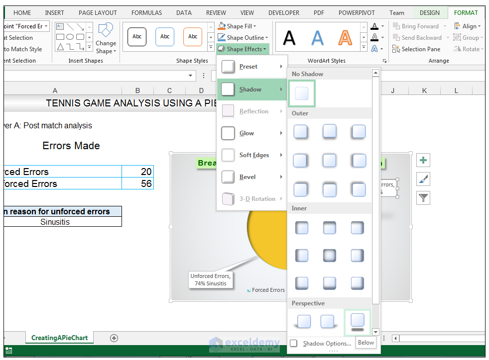
- With the Data Callout selected, for this particular data point, go to Chart Tools>Format>Shape Styles and click on the drop-down arrow next to Shape Effects and select Shadow and choose Perspective>Below.
- Delete the legend since the information needed, is already displayed in the data callouts and increase the size of the chart to 8.71 cm by 14.45 cm.
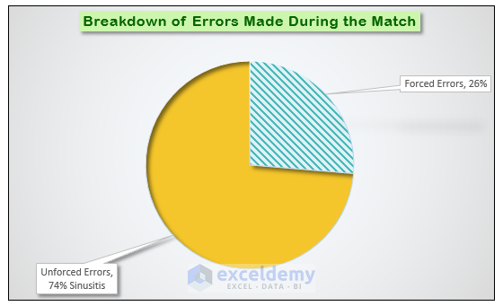
The tennis coach now has an analysis of the match errors presented in a visual format and a way to hone in on the cause of the unforced errors.
Related Article
- Excel Pie Chart Labels on Slices: Add, Show & Modify Factors
- How to Change Pie Chart Colors in Excel (4 Easy Ways)
- Add Labels with Lines in an Excel Pie Chart (with Easy Steps)
- How to Edit Pie Chart in Excel (All Possible Modifications)
- Create A Doughnut, Bubble and Pie of Pie Chart in Excel
- How to Make a Pie Chart with Multiple Data in Excel (2 Ways)


