This tutorial will guide you on how to make Excel spreadsheets easier on the eyes and pleasing to work with.
12 Quick Tips to Make Excel Easier on the Eyes
Try these tweaks and changes to make your spreadsheets more pleasing and presentable
Method 1 – Fitting Column Width and Row Height Properly
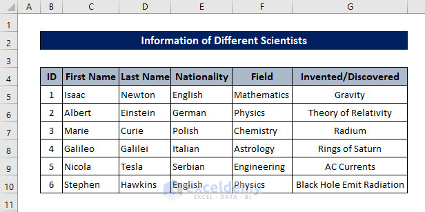
The biggest step you can take to make Excel easier on the eyes is to properly fit the column widths and row heights. Not only is improperly fit data stressful on the eyes, but smaller cell sizes often don’t display the proper values. For example, consider the following dataset:
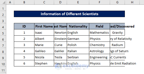
The widths of Columns D and G are less than that required for the data they contain.
- To automatically adjust column widths, place your mouse cursor in between the column labels after the column for which you are changing the width. For example, to change the column width of G, place the cursor between labels G and H.
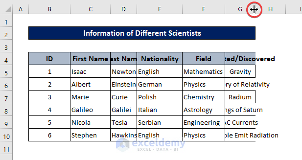
- Then double-click.
This will automatically resize the column width to fit all of the data properly.
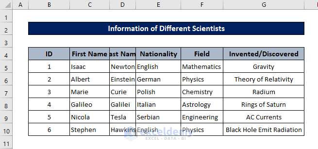
- Instead of double-clicking, you can also manually click and drag the cursor to create a custom width. Or right-click on the column label and select Column Width from the context menu.
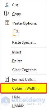
- Then select a custom width for the column.

All of these operations can also be done on row labels to change the row heights.

We can certainly say that with properly sized column widths and row heights, the spreadsheet now looks easier on the eyes than before.
Method 2 – Hiding Unnecessary Columns/Rows
If there are long gaps in between your datasets, you can manually drag one of them to lessen the gaps. But there could be columns or rows in a dataset that are simply irrelevant.
For example, suppose in the dataset below that we don’t need to see the nationalities of the scientists. Deleting the column will permanently remove the data from the spreadsheet, which we don’t want, so hiding the column is our best option here.
- To hide a column or a row, right-click on the label and select Hide from the context menu.
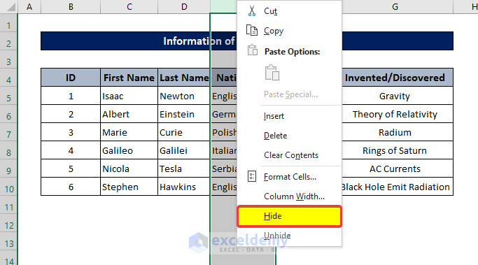
This will hide column E in this dataset.
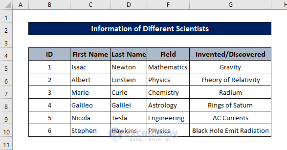
You can do the same for row labels to hide rows.
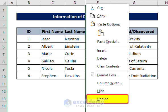
- To unhide columns/rows, simply right-click on the hidden label and select Unhide from the context menu.
Method 3 – Merging Cells to Make the Dataset Visually Attractive
Merging different cells in a row or column, especially for headings, makes the dataset in a spreadsheet more pleasing. This also helps prevent awkward cell sizes in the dataset. For example, with an unmerged heading, the dataset below looks like this.
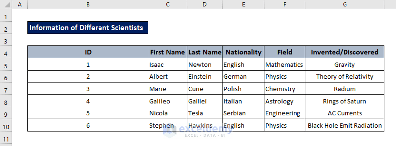
- To merge cells, first select the cells you want to merge. In this case, it is the range B2:G2.
- Then select Merge & Centre from the Alignment group in the Home tab.

This will merge all the cells from the range as one.
Read More: How to Make Picture Background Transparent in Excel
Method 4 – Freezing Panes at Required Positions
Scrolling through a large dataset and continuously checking for which data belongs under what header is tiresome. For situations like this, you can freeze panes – both columns and rows. Then you can easily scroll your spreadsheet to any position and still be able to see the headers, or whatever other information you need..
- To freeze any number of columns or rows, select the cell after the to-be-frozen column/row, then select Freeze Panes from the Window group of the View tab.

Method 5 – Wrapping Text
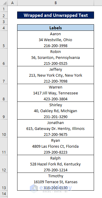
Compare the examples of wrapped and unwrapped text in the dataset below.
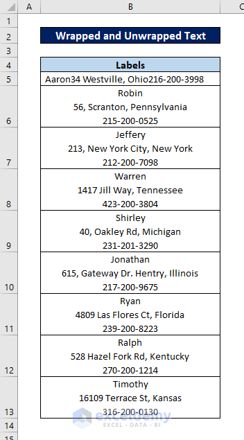
The content in cell B5 is unwrapped while the rest are wrapped. The wrapped labels are easier on the eye.
- To wrap text, select the cell and click on Wrap Text from the Alignment group of the Home tab.

The text will be wrapped automatically.
Method 6 – Using Different Heading Styles
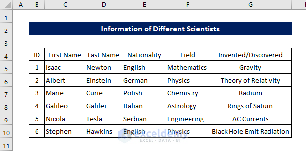
We can format the headers of datasets to make them stand out more, for example filling them with colors and/or using bold and larger fonts. For example, consider the same dataset with two different formats in the headers.
Unformatted:
Formatted:
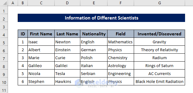
Certainly, the second one looks more pleasing and is easier on the eyes.
- To change the font style to bold, click on the Bold icon in the Font group of the Home tab.

- Click on the fill icon and select a color in the same group to change the fill colors in a cell after selecting it.

Method 7 – Adding an Appropriate Border
Although a spreadsheet like this is still readable …
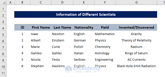
… this one stands out a lot more.
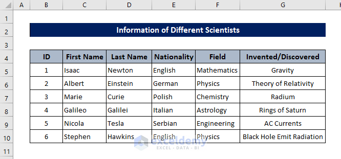
- To add borders like this, go to the Home tab and choose a border style from the Font group.

Read More: How to Make Excel Spreadsheet Colorful
Method 8 – Formatting Cells Based on Their Contents
Formats can be added to other cells as well as headers. Coloring cells based on their contents will make them stand out more. You can add borders, different font styles, font sizes, or colors based on different values, all of which can make the Excel spreadsheet easier on the eyes.
But too much formatting in a dataset can turn it into an eyesore. Moderate use will have a more powerful effect.
Method 9 – Using a Table in Your Worksheet
Sometimes converting a dataset into tables makes them more visually pleasing. The table styles in Excel are much easier on the eyes than an unformatted dataset. Moreover, Excel tables allow access to more features than a normal range.
To add a table style to a dataset:
- Select the whole dataset.
- Go to the Insert tab on your ribbon.
- Select Table from the Tables group.

After converting the previously mentioned dataset into a table, it will look something like this.
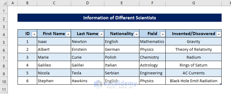
You can also change the table style from the Table Design tab that appears once you select a cell from the table.
Method 10 – Adding Data Bars
If you have a dataset containing numeric values like one below, you can add data bars that help with the visualization of the data.
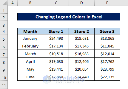
Steps:
- To add data bars, first select the cells where you want to add data bars.
- Go to the Home tab on your ribbon.
- Select Conditional Formatting from the Styles group.
- Select Data Bars from the drop-down.
- Select the style of bars you prefer.
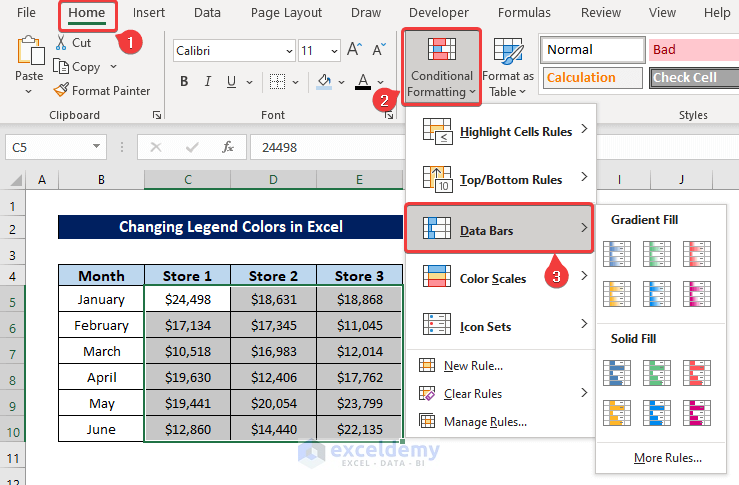
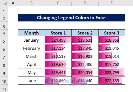
With data bars, the table will now look like this:
Method 11 – Adding Sparklines for Quick Visualizations
You can also add sparkline graphs, especially if you don’t have a final graph for visualization.
For example, let’s take the previous dataset.

Now let’s add some sparkline graph.
Steps:
- Go to the Insert tab on your ribbon.
- Select Line from the Sparklines

- Select the Data Range and Location Range in the Create Sparklines box.
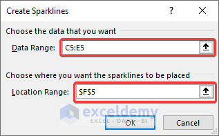
After clicking on OK, this will create a sparkline at the location.
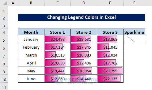
- Select the cell then click and drag it to replicate it for the rest of the cells.
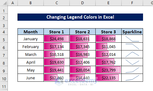
Another helpful trick to make Excel easier on the eyes.
Method 12 – Adding Shading to Alternate Rows
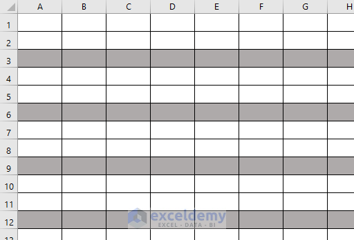
Another aesthetically pleasing approach is to add shades to alternate rows or columns. We need a combination of the MOD and ROW functions to accomplish this look.
Steps:
- Select all of the cells in the spreadsheet by either pressing Ctrl+A or the triangle sign where the row and column labels meet.
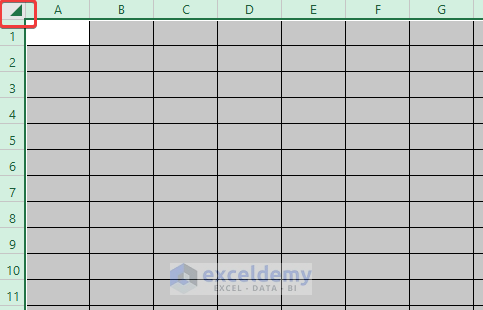
- Go to the Home tab on your ribbon.
- Select Conditional Formatting from the Styles group.
- Select New Rule from the drop-down.
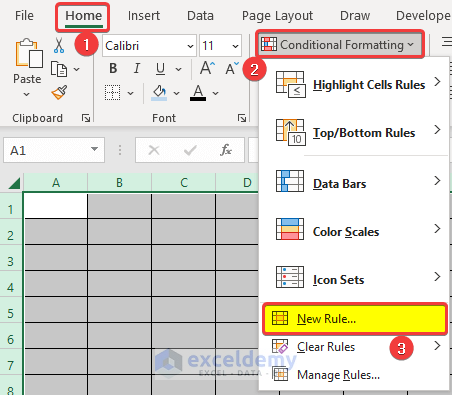
- In the New Formatting Rule box, select the Use a formula to determine which cells to format for Select a Rule Type.
- Enter the following formula in the box under Format values where this formula is true.
=MOD(ROW(),3)=0
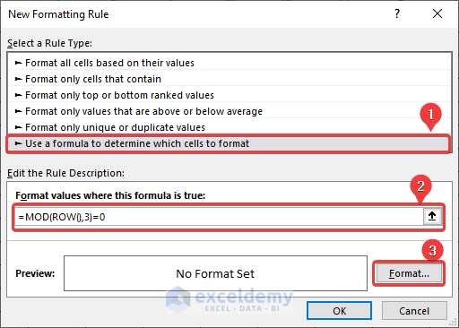
- Click on Format.
- Select the shade color you want from the Fill tab of the Format Cells box.
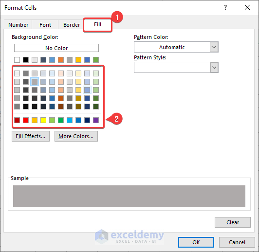
After clicking on OK in both boxes, the spreadsheet will look like this.
Now you can use the spreadsheet as normal.
Download Practice Workbook
Related Articles
<< Go Back to Excel Background | Learn Excel
Get FREE Advanced Excel Exercises with Solutions!

