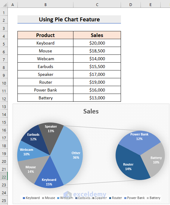
What Is a Pie of Pie Chart?
Pie of Pie Chart is a Pie chart under which there will be a secondary Pie chart. The Pie of Pie chart separates some small slices of the primary Pie chart to a secondary pie chart.

How to Make a Pie of Pie Chart in Excel: 4 Steps
We will use a sample dataset, which contains 2 columns: Product and Sales.

Step 1 – Inserting the Pie of Pie Chart in Excel
- Select the data range. We have selected the range B4:C12.
- Go to the Insert tab.
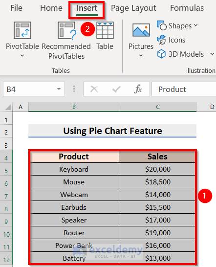
- From the Insert tab, select Insert Pie or Donut Chart.
- From 2-D Pie, choose Pie of Pie.
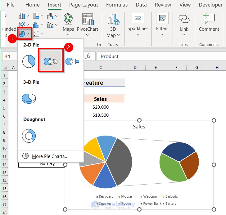
- You will see the following Pie of Pie Chart.
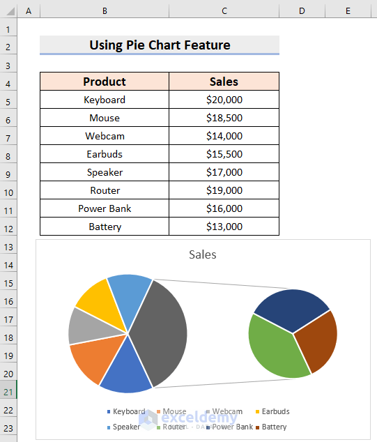
Step2 – Changing the Style Format
- Select the Chart.
- Click on the Brush Icon.
- From the Style tab, select a style. We have selected the 11th style.

Read More: How to Make a Pie Chart in Excel
Step 3 – Applying Color Formatting
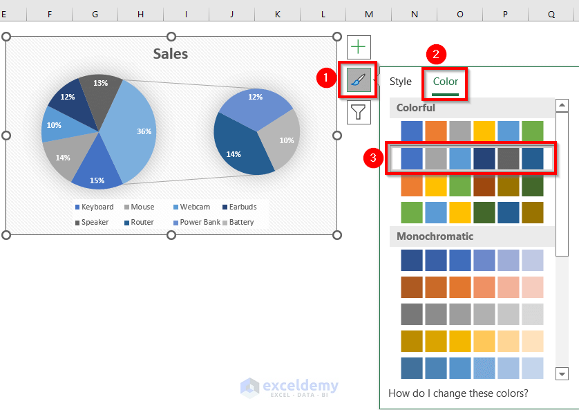
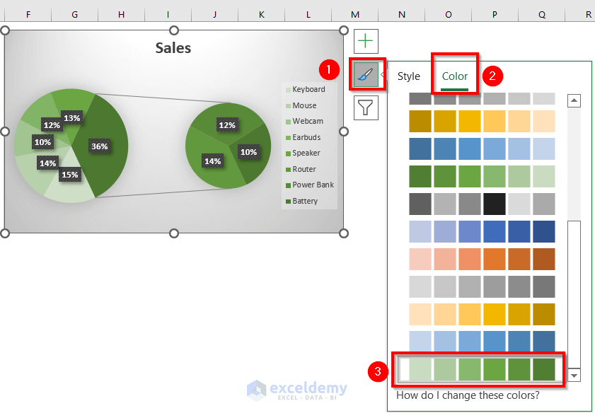
- Click the Brush icon and select the Color tab.
- Choose your color palette. We have chosen the 2nd option under the Colorful palettes.
Read More: How to Create & Customize Bar of Pie Chart in Excel
Step 4 – Formatting Data Labels
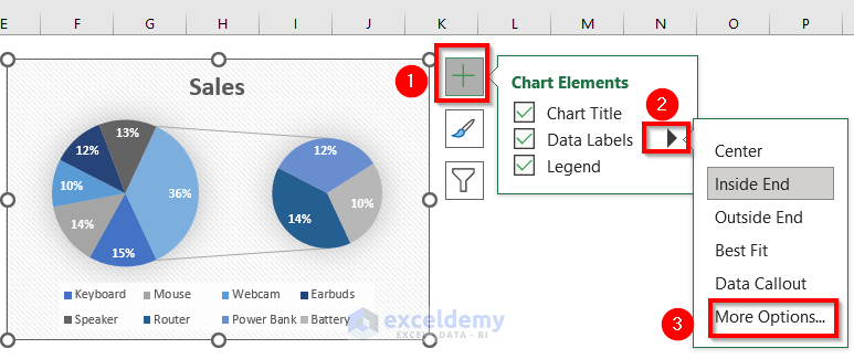
- Click on the + icon.
- Expand Data Labels and select More Options.
- You will see the following panel.
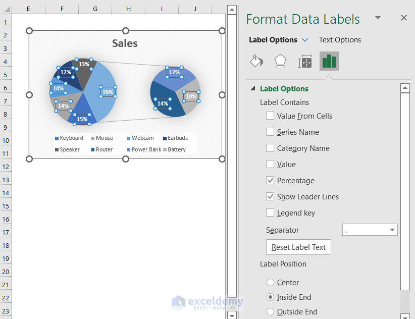
- From Label Options, choose the parameters you need.
- We have added a Category Name. Percentage and Show Leader Lines are auto-selected.
- We have selected Label Position as Inside End.
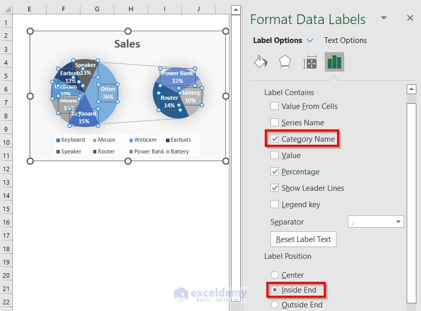
- You will see the formatted Pie of Pie Chart.
Read More: How to Make Multiple Pie Charts from One Table
Alternative Way to Format a Pie of Pie Chart Using the Ribbon
Steps:
- Select the Pie of Pie Chart.
- Go to the Chart Design tab in the Ribbon.
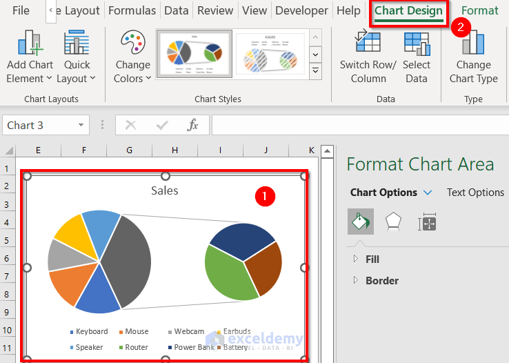
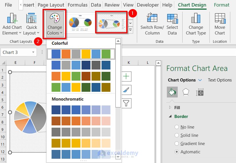
- Choose the design format under Styles. We have chosen the 11th style.
- Change the colors under Change colors. We kept the auto-generated color.
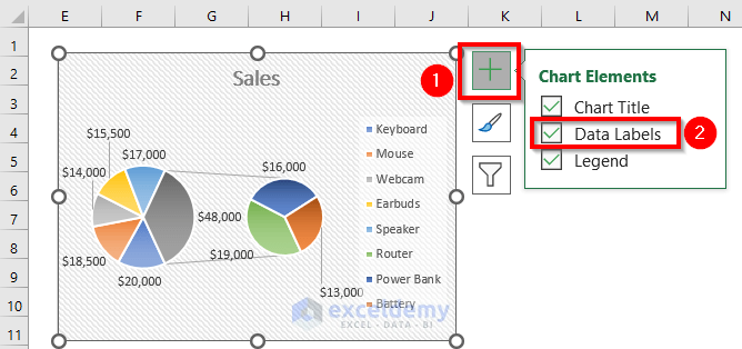
- For formatting the data labels, select the Data Labels feature.
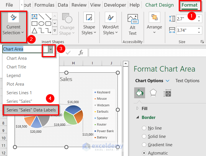
- Go to the Format tab in the ribbon.
- From the Current Selection option, select the Series “Sales” Data Labels.
- You will see the following panel.
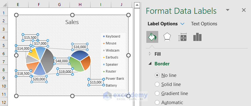
- Choose Label Options from Format Data Labels.
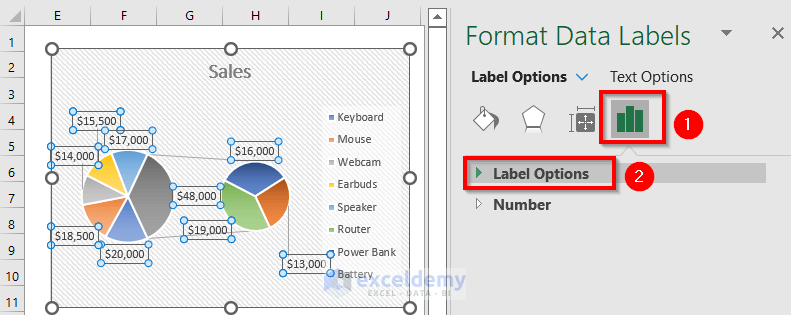
- We have selected Category Name and Percentage from the Label Contains and chosen Best Fit from the Label Position.
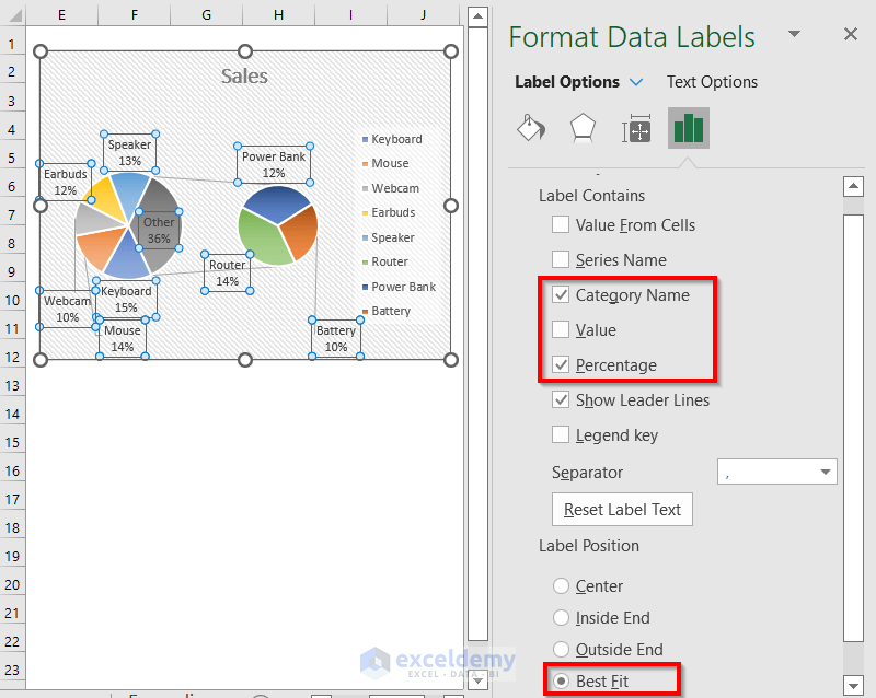
- Here’s the result.
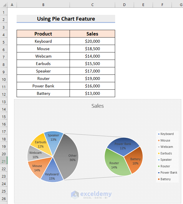
Read More: How to Make a Multi-Level Pie Chart in Excel
Expand a Pie of Pie Chart in Excel
Steps:
- Select the data range. We have selected the range B4:C12.
- Go to the Insert tab.
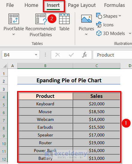
- Select Insert Pie or Donut Chart.
- From 2-D Pie, choose Pie of Pie.
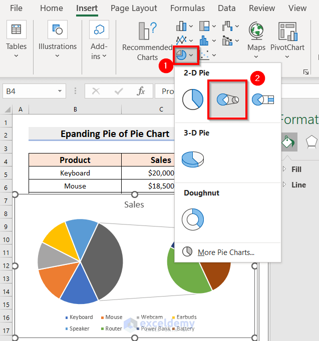
- You will see the corresponding Pie of Pie Chart.
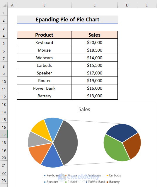
- Format the chart. We have changed the chart style using the Brush icon.
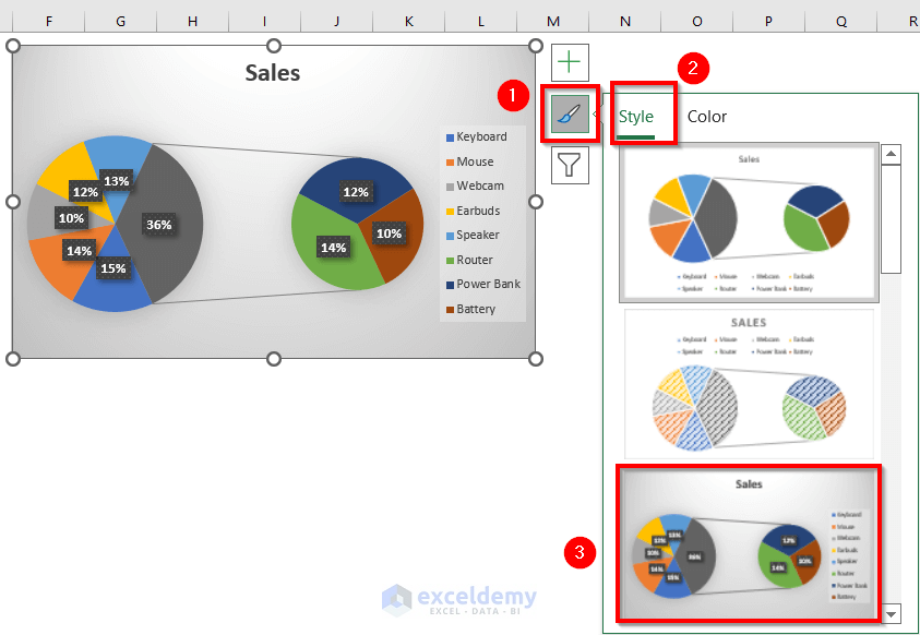
- We have changed the chart color using the Color feature under the Brush icon.
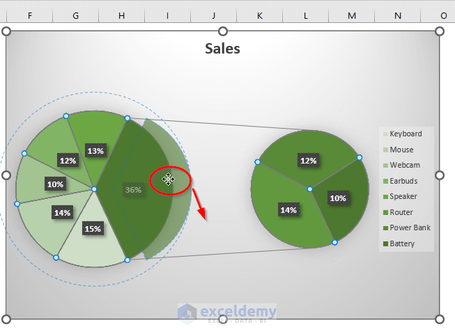
- Click on the Pie and drag any slice outward.
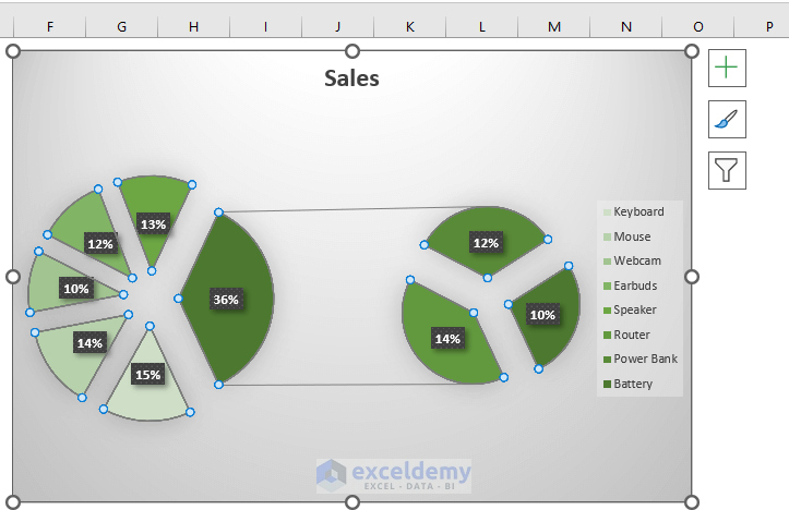
- You will see the following result.
Read More: How to Create a 3D Pie Chart in Excel
Things to Remember
- If you delete any entry from the data range, it will also get deleted from the chart. However, the symbol under the Legend Options will remain.
Practice Section
We’ve included a dataset that you can chart and experiment with.

Download the Practice Workbook
Related Articles
<< Go Back To Make a Pie Chart in Excel | Excel Pie Chart | Excel Charts | Learn Excel
Get FREE Advanced Excel Exercises with Solutions!
